Blue Marlin in Weight Watchers project
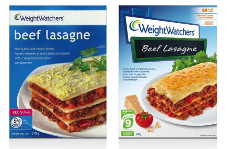
Design agency Blue Marlin has carried out a packaging rebrand on behalf of client Weight Watchers.
The announcement:
National Media Release, 18th May 2011 – Sydney-based brand design agency Blue Marlin has recently rolled out an entire new packaging design system for consumer brand Weight Watchers.
Weight Watchers operates across 38 categories with some 220 products and has a net worth of $224 million dollars per year, in the Australian and New Zealand market.
The company recently launched its new weight loss and nutritional program ProPoints, the biggest program development the brand has implemented in over 15 years. This instigated the decision to also contemporise the brand’s packaging design.
Yet the company was struggling to gain standout on shelf with employed research suggesting that two in 10 buyers were bypassing the product in store.
Blue Marlin was engaged to create a more contemporary, striking and consistent packaging design system that reflects the brand’s move to appeal to a broader market, beyond its established program members.
“From ice-cream to cereal, there was a real inconsistent use of the master brand, the colour blue, the fonts and photography that obviously led to a fragmented look and feel for the brand,” says Blue Marlin creative director Ian Catling.
A multi-faceted solution was required to work across the various licensing categories to drive product sales and to allow the brand to exist in the “aspiring healthy-living” and well being market segment.
“We created a much stronger system that offered a recognisable brand footprint that not only had enough rigour to accommodate new product development but also allowed flexibility for individual category drivers and language,” Catling says.
“We also wanted the consumer perception to shift from the brand being about weight loss to one that is more of a lifestyle choice.”
The new design introduces iconography to depict meal occasion and ingredient and food photography to deliver taste appeal.
The updated copywriting aims to encourage a more light and friendly approach to healthy living. On the back of the packs is the inclusion of motivational messaging with a focus on well being and nutritional value.
“Blue Marlin has delivered a ‘best in class’ design that will inspire and motivate consumers to be proud of what they’re purchasing,” says Rebecca Egan, senior brand manager – licensing at Weight Watchers.
“The fun, fresh and innovative design has revolutionised our packaging and offered a unique point of difference within the category, whilst maintaining strong stand-out on shelf by keeping the ‘blue’ background that is positively synonymous with Weight Watchers,” says Egan.
Blue Marlin London has also picked up the account in the United Kingdom.
Source: Blue Marlin press release


So what? This is crap. The lasagna is still rectangular.
User ID not verified.
Love this line: “We created a much stronger system that offered a recognisable brand footprint that not only had enough rigour to accommodate new product development but also allowed flexibility for individual category drivers and language”
Ummmmm… so you redesigned the box then?
User ID not verified.