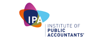
The Institute of Public Accountants rebrands with new logo
The Institute of Public Accountants (IPA) has rebranded with a new logo to better align with small businesses and lift its market presence.
Catherine Cleary, general manager of marketing at IPA, told Mumbrella the brand refresh was conducted to raise the institute’s profile, share more insights and represent its “recalibrated vision”.
Created by Bastion Effect the new logo signifies “the power of three” which is flexibility in marketing approaches, small business clients and IPA’s business, Cleary said.
“We believe the logo represents who we are warm, open, full of integrity, knowledgeable, confident , self-assured and wise,” she said.
In a statement Cleary said: “Our brand is not just a change of logo. It is about what we say and how we say it; the language we use and the way we engage with our members, colleagues and external stakeholders.
“It is also about having the conviction of not only what we do but why we do it and for the IPA Group that is to improve the quality of life of small business; this is something our members have a strong affinity with.”
When asked if Alex Malley’s CPA scandal had damaged the reputation of accounting, Cleary declined to comment.
The rebrand has been accompanied by two three minute profile videos of IPA accountants Debra Anderson and Daniel Moore.
The videos aim to show customers IPA’s accountant’s aren’t always “typical accountants”.
Moore shares his passion for motorbikes throughout the video while Anderson shares her passion for small businesses and being a single mum.


 Linkedin
Seems to be just another five-pointed star.Will IPA be selling itself out to an international organisation soon? Remember Jetstar?
User ID not verified.