Gold Coast Games logo unveiled
 The Gold Coast 2018 Commonwealth Games has unveiled its logo, created by brand and design firm WiteKite.
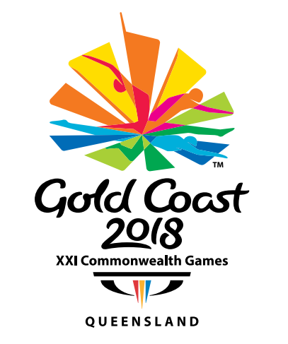
Featuring a gymnast, a hurdler and a swimmer, the logo is designed to capture Gold Coast’s personality – “positive, energetic, colourful and fun”, according to a press release.
Commonwealth Games Minister Jann Stuckey said: “The emblem has been inspired by the Gold Coast’s stunning beach side location, its iconic skyline, and the colours are representative of the coast, the hinterland and the celebratory atmosphere which is synonymous with the region.”
“Centred upon fluid representations of a gymnast, a hurdler and a swimmer, the emblem reflects the Games’ deep heritage and humanity,” Stuckey said.
Praise be, they’ve nailed it…
Before the inevitable Attack Of The Knockers – by which I refer not to the 1950s B-grade 3D sci-fi movie but the people who flock to knock anything – let me say that I reckon this is an EXCELLENT logo/ Very striking, very effective, quite unique – love the way those ‘fan’ elements contain the Olympic colours in softer shades as well as portray different sports. Well done WiteKite!
yeah, i quite like it.
pretty familiar in that it looks like loads of previous ‘olympic/commonwealth’ efforts but its still strong.
ps – can we call it a brand mark rather than a logo? im sure its intended to be part of a much larger branding and identity campaign no?
I for one just love Nige’s statements… full of such great phrases like ‘deeper emotional factors’ and ‘core proposition’ – brilliant!
Who are WiteKite? And why, when you put their name into Google, does nothing come up? A design firm, designing an international logo, for the Commonwealth Games, with no website?
This makes no sense.
#FAIL
This can’t possibly be a logo for a sporting event. It looks fantastic.
Certainly something comes up in my search engine……
Love the graphic but what’s with the typography?? Fluid yes – but ugly in my opinion..
now please don’t bugger this up by having a great logo and awful mascots.
Well, if someone can link me to their website, I’d love to see it….
Simon, Google found me this – http://www.gc2018.com/
Looks like the 30th anniversary logo for World Expo 88.
If it is then great job.
‘…the logo is designed to capture Gold Coast’s personality…’
Well, if that was the brief, I think they nailed it: commercial, interchangeable, unispiring, pleasant but meaningless. Just like the arbitrary glass and steel highrise on a pretty beach has become the cliche for interchangeable modern destinations, this logo reflects everything that has become a standard in recent years for sporting events: friendly rainbow colours, brush stroke type, a dynamic human element. It looks like many sporting event logos before and therefore it is meaningless and unremarkable. I don’t like the typical design bashing that inevitably happens with any identity reveal, but in my opinion this is an average job and therefore a lost opportunity for creating something exciting and remarkable.
@ Jack B. Nimble, so ‘Age of the Knockers’ is a 50’s sci-fi movie? I must have ordered the wrong one online.
Nice to see a local group doing work that the big boys usually poach…at least one assumes that they are local..
Great work!