South Australia’s new ‘origami Pope hat’ logo prompts online competition to find a better one
South Australia’s new ‘origami Pope hat’ logo
An online design group has launched a competition to find a better logo than the new one just launched by the South Australian government.
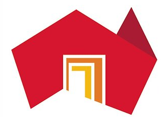
The $1.3m logo – which depicts the region as a doorway into Australia – was created by Melbourne design firm Cato Purnell Partners, which was hired in September last year to tackle South Australia’s identity conundrum.
But the new logo – which replaced the ‘Brilliant blend’ logo designed by Parallax Design and ad firm KWP! – has being heavily criticised, with Gruen Transfer host Wil Anderson likening it to a Pope’s mitre made from origami.
But where is Tasmania?
I, for one, love the new brand. Ok, maybe I strongly like the new brand. I’m not 100% sold on the colours but otherwise, I think it’s terrific. I love the concept of SA being the doorway to Australia and it having a doorway into the amazing diversity the state has to offer. I think leaving Tassie off was a bit harsh, but that and the colours are my only gripe. Thank god it’s not a butterfly or peacock or bloody lizard like so many of the entries on 99designs!
Dear Ken….
I thought this was the new block TV series logo haha
It is appalling.
It looks like a logo for a 1970’s building society…
you cant judge it fully till you see the rollout
I have tears rolling down my cheeks over this, it’s so so bad it’s hilarious. Maybe SA can give it to Cardinal Pell in his bid to be the first Australian Pope?!
Firstly, let me say that I am a fan of the new branding. Secondly, this is a recurring issue every time a re-brand is highlighted – plenty of critics (most of whom challenge the cost/budget).
If you’ve never been involved its very easy to throw cheap shots.
Until you’ve ever experienced the process, the stakeholders, the staging sign-offs, then you are in no position to accuse or ridicule.
By the way I have NO connection with Cato Purnell Partners.
And further – caveat emptor with 99Designs and other such domains – the last refuge of a well intentioned Brief and first refuge of ill-informed Clients.
I HATED the brand on reveal. However, on consideration I think, if the brief was to show where we are located, it succeeds. That said, I still have a slight problem with that brief – will people really now go “Oh THERE you are South Australia (I had no idea!) – I really must visit/ invest now”. The logo as it was presented at the launch is a bit bland, dated and does look like something to do with housing scheme but now I have seen some of the broader executions (www.brandshouthaustralia.com.au) I think it may have legs…..As long as it can be used to convey the ‘why’ and all the bits I love about this state.
Ps. The 99 Designs wth butterflies and kangaroos – WAY WORSE.
Can someone who actually knows say what the $1.3M bought? One might assume there is a bit of asset rebranding work in that, after all, you’d be bonkers to pay that much just for a logo. But maybe this explains in part why SA is a financial basket-case.
We all know the image is irrelevant. It’s the intangible elements that come to mind when you view that image that are important. What does South Australia stand for?
I’m not a fan of the new logo but I hardly think letting a bunch of designers with no brief have-at-it is any better. Industry ridicule does no one any favours. We whinge when clients think their nephew could do a better job and then suggest the same when we see something we don’t like?
Adelaide is ‘the city of churches’ so bang on target!
Also, Tasmania IS there – they just left out Bass Strait.
^ what Mel said.
Which bank?
Looks like an 80’s powersuit.
A logo doesn’t make a brand. Time, products & actions make a brand, which is hopefully identifiable through its logo. The Nike swoosh didn’t mean anything when it was launched either.
The hard work is ahead of SA now. I just hope that one day that logo signifies a door into a really great place to live, work & visit, rather than a door showing people the way out!
Doorway to Australia? How do I get in on the sweet cash available to dupe state governments?
People are confused about where South Australia is? A name change would have been better.
MiddleBottom Australia will do the trick.
Do I get a biscuit?
The logo is eye-catching, rather novel and unforgettable. What’s wrong with that?
. . . and highly topical.
Having had the privileged of working Cato Purnell, as one on many top-shelf design companies I’ve known, I can say that they deserve their place at the very peak of the industry. This company was miles ahead for years and a simple trip through the portfolio leaves you wonder who else has created so many iconic Australian brands. When you ask “what other Australian design firm has worked so successfully internationally?” the answer is zero. It is zero too for “what Australian design firm has really contributed to international industry development?” While others may have caught up, none have done so much good design work. So before you make another half-arsed comment, Will Anderson included, take a tour of Cato Purnell’s portfolio and see how smart you are after that.
Cute, funny etcetera.
Now why don’t we also the the piss out of Islamic imams, hijabs, Mohammed and the rest of the gang? What? You’re frightened they might get pissed off and come after you?
Thought so. Why mock one religion but not all of them?
None of them is above criticism, but I guess creativity and courage don’t always go together.
Cato Purnell are an excellent brand agency – with or without Ken. New logos always attract criticism – particularly when they are high profile. it’s the use of them that determines whether or not they work. Channel Seven’s brand revamp attracted criticism at the time and has stood the test of time.
This recent trend of online services sites like Freelancer.com or 99 Designs attacking others work purely as a means of self-promotion is a cheap publicity stunt and it’s mean spirited.
And hey, if you want a truly “local” firm for one of these kinds of VERY Australian briefs then hire one. Those sites send work offshore.
Okay, so the general consensus isn’t great. But before we hang the designer maybe we should look at the client.
Whilst it is the imperative of any agency to champion good design AND good ideas equal responsibility surely must be apportioned to the client. No one agency can fully accommodate poor judgement and a lack of vision. You only have to look as far as our current stock of politicians to understand that.
Now, in saying all that in comes 99 designs on their white charger to save the day. Seriously?. Any new brand out of context is only a logo and wallpaper at best. Personality and application comes with age. For me, I might not personally like the new logo but I’d rather trust in 25++ years of experience than a throw it at the wall and see what sticks approach.
Like it or not. Cato 1 / 99Designs 0.