Ampol reveals new visual identity ahead of Caltex rebrand
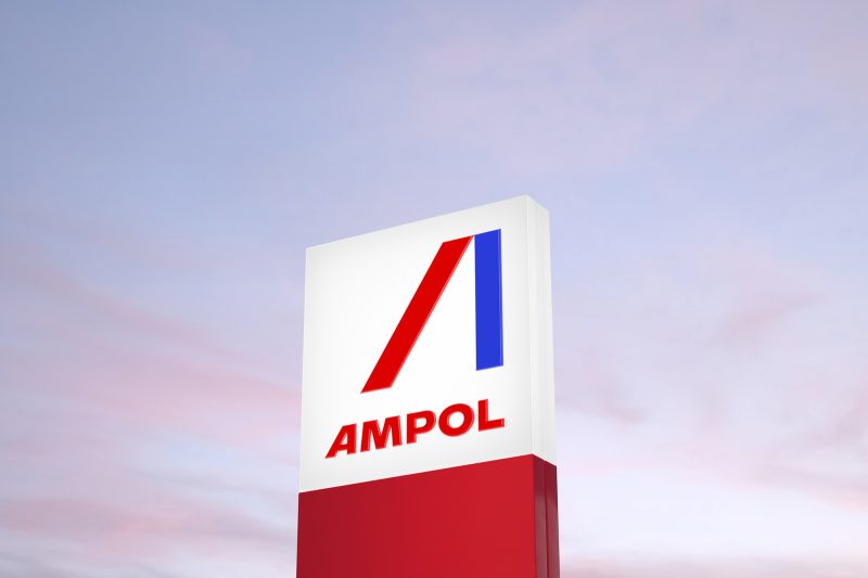
Ampol has revealed its new visual identity, as created by branding and creative agency Houston Group.
In December 2019, Caltex announced it would be reviving the Ampol brand and transforming its business to the heritage brand over a period of three years.
The new Ampol brand will roll out in Caltex stores throughout the second half of this year.
The Ampol brand was retired 25 years ago. The decision for Australia’s Caltex business to return to the brand was sparked by the expiration of the licence for Caltex after US oil company Chevron sold its 50% stake in the Australian business in 2015.
I really like this. Great to have an Australian back. Looks very contemporary.
Such a shame.
Bigtime missed opportunity.
Nice idea, but poorly executed logo mark.
Forgettable. Boring. Dull.
Not what you want for “the centerpiece of the new design”.
lacks that solid visual impact you get from, say, Shell or BP signage as a ‘beacon’ like statement at the side of the road
“Let’s use a different typeface. That logo will be $50,000, thanks”.
Yeah. This is solid work, but given the outcome, you didn’t need to hire a big agency to do it.
Hello. This is 1983 calling. We want our logo back.
I think the stylised ‘A’ needs some curves. It’s a bit basic.
Google American Motor Corporation and make up your own mind….hmmm. Looks like throw-back to Detroit 1970 to me, instead of a return to a once iconic Aussie brand with huge residual awareness 1936 -1995.