F.Y.I.

Bega unites as one in corporate rebrand, via the Edison Agency

Bega Group has worked with the Edison Agency to undergo a corporate rebrand.
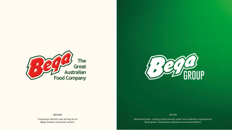
The announcement:

The newly named Bega Group has rolled out a new brand identity to better reflect their business transformation ambitions, purpose-led initiatives and what their businesses units stand for today.

Following an extensive insights-led process, Bega Group felt the time was right to evolve the corporate brand from red to green, symbolising the shift from its long history in cheese to a multi-category food, beverage and ingredients business. Existing product brands (including on cheese and Bega peanut butter) will continue with its trusted red logo but the new Bega Group identity will serve to unite all business units as a single Group, following the 2021 acquisition of Lion’s Dairy and Drinks portfolio.

The Edison Agency developed the strategy and new brand identity system to capture the humility and social purpose sitting at the heart of the Bega Group culture. The evolved brandmark reflects the business’s authentic connection to its home in the Bega Valley, an important part of the business’s iconic history as one of Australia’s oldest dairy producers.

Showcasing their commitment to the Australian environment, it’s people and farming communities – the new brand signifies change for a “better future”.

Bega Group CEO, Paul van Heerwaarden, said: “Following several acquisitions in recent years and a significant transformation of the company, it was important that we represent the Bega Group of today and how we continue to serve all Australians with great food for a better future. Working closely with Amber and the team at the Edison Agency, they were able to capture this in the new design that we are very proud of.”

The new Bega Group identity was a project that evolved from the heart of the Bega Valley itself – initiated by a consumer and stakeholder research project led by The Edison Agency and strategic research partners, Pollinate. The research gained much needed insight into the perceptions of both the corporate and consumer Bega brands – identifying a key opportunity to increase the corporate brands link with the Bega Valley and its transformative circular economy initiatives.

Founder and head of strategy at the Edison Agency, Amber Bonney, says “The Bega Group is a rare find in business today – strong, innovative but exceptionally humble. Proudly Australian, the business is responsible for some of Australia’s most trusted brands like Vegemite, Bega Peanut Butter, Dairy Farmers, Dare and Big M.

Our role in this project was to gather the insights and create a blueprint for change that was iterative and engaged key functions of the business to create a collaborative brand solution that reflected the needs of their people, many of whom have been with the business for more than a decade.

The visual identity evolved from of the business’s commitment to growth and humility – in separating the corporate brand from the product (particularly cheese) brand we are able to reflect the true scale of the group across their foodservice, nutritional’s and ingredients, dairy and drinks and foods portfolios. As a purpose-led business ourselves, we are proud to have been trusted with such an important junction in time for this Aussie success story.”

As well as a new brandmark, Edison developed a comprehensive new print and digital design system including a bespoke purpose signature, dynamic new colour palette, photography image bank, infographic library, wayfinding, truck livery and marketing collateral templates.

Darryn Wallace, executive general manager (dairy and drinks), added: “The new brand language is a symbol of our commitment to transformation through social impact. Historically, our corporate profile has been intrinsically linked to our cheese brands but now we have the opportunity to celebrate so much more – great brands, an innovative culture, commitment to our people, farming community and partners. One of the most important attributes of the new corporate design is the creation of a bespoke signature to bring our purpose of “Creating great food for a better future” to life as the hallmark rally cry. We are proud of the new design– it’s fresh, dynamic and warm and sets the business up for an exciting next chapter of growth.”

Source: The Edison Agency

ADVERTISEMENT

Get the latest media and marketing industry news (and views) direct to your inbox.

Sign up to the free Mumbrella newsletter now.


SUBSCRIBE

Sign up to our free daily update to get the latest in media and marketing.