Ikon Communications undergoes a brand refresh
 Media agency Ikon Communications has shed its old logo in a favour of a brand refresh.
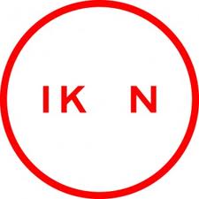
The moves sees the company dump the old round logo, with the missing O, which the company has had since it was launched by Simon White and Gary Hardwick in 1999 to service the Commonwealth Bank media account.
 Ikon new logo sees the company adopt a more freeform organic logo and it appears it will also launch a new website, although it currently has a holding page in place.
The company did not respond to requests for comment on the rebranding and which agency was behind the new design.
Care factor……..zerO
Cared enough to comment though didn’t ya @ Leo G. How about growing a pair and putting your name to your comment. At least we can all then know the source of such wisdom.
The logo logo looks great!
It should give them the edge they need in retaining Commbank.
The rebrand looks awesome and was done inhouse by designer Jacalin Ding.
Lipstick on a pig…..
Looks cool, something different, interesting to see how it rolls out
FFS what is wrong with the management of this place. Major clients are being lost left right and centre and their response is to change the company logo.
That’ll bring em back!
It does seem an odd time to re-brand, but actually it’s nobody’s business but the agency’s and their clients. It reminds me of when Seven Network moved to their current logo (15 years?) ago and at the time senior sales staff mentioned the negative “feng shui” of the old round logo, their fortunes certainly turned around and I hope the same happens for Ikon.
considering no comment or press release has been made by the agency on this, perhaps we should hold off on making comment. I assume there is more to this than “lets change the logo”
OK. ‘Fess up.
Who spilt the liquid paper on the photo?
A mess loosely resembling something. Not exactly sure what, but it’s somewhere in there. Matches the company at least.