News Corp reveal new logo
News Corp has a new logo for its publishing arm the new News Corp based on the handwriting of Rupert Murdoch and his father.
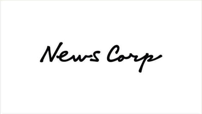
The logo was unveiled as News Corp outlined its vision for the media company to investors in New York and will replace the striped globe of the current News Corp brand.
CEO of the new News Corp Robert Thomson said in an email to staff that the new News Corp is “not naive about the challenges facing some of our newspapers” and “in the midst of a transformation of those businesses. Costs are being confronted,” The Australian reported.
I did this logo on some tissue for them whilst having a ‘man break’ one morning.
Billed them $400k!
Awful. But I guess you don’t f@ck with the boss (particularly when it’s uncle Rupert.)
I really really want to hate it…..but I actually don’t. It’s kind of tasteful
New Logo. Same BS
How unimaginative. Totally boring and done a thousand times. Yawn.
looks like a dodgy word font.. up there with RyanAir
I think comic sans would have been more appropriate
http://www.ilustra.com.ua/uplo.....t_logo.JPG
Reminds me a little of Leo Burnett’s logo.
I like it.
haters gotta hate
Ow that is so cool and cursive, just like a letter from grandma!
I want to go on News Camp. Is that what it’s advertising?
I think this could have been a LOT worse – while the end product may seem a bit simple, the idea behind it is dead clever.
While I really like it, and reconnecting with the intimate nature of story-telling, I can’t help but read: News Carp. Which may be more apt.
I actually love the logo – if you read what they are trying to do its spot on.
I think it’s great too. Feels a lot more human than previous.
Love the story behind it. Not sure if that completely shows in the end product though. 3/4 the way there.