Qantas reveals new logo and typography
Airline Qantas has revealed a new logo for just the fifth time in the company’s history, moving on from the 2007 iteration of the design created by Hans Hulsboch.
The tweaked logo is also accompanied by new typography for what is arguably Australia’s most iconic brand.
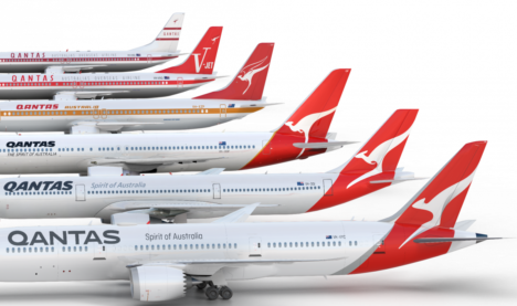
How the Qantas livery has evolved since 1944
According to the airline: “The new design was overseen by Qantas consultant designer, Marc Newson, in partnership with Australian design agency Houston Group.”
Etihad and QANTAS logo’s look very similar. Is QANTAS copying it’s partner?!
It’s Emirates that is Qantas’s partner. Not Etihad.
its partner, not it’s partner, come on…
You missed a capital letter Grammar fascist.
Oh come on, your such a grammar fasc… oh… carry on.
that’s punctuation not grammar, c’mon!
No! You’re the one who’s in error!
Brent, correctly wrote:
It’s Emerates that is Qantas’s partner
ie It is Emerates that…
He could have dropped the final ‘s’ on Qantas’s, but that in the main is a matter of personal preference.
The quote being in question is “Is QANTAS copying it’s partner?!” and not “It’s Emirates that is Qantas’s partner”
@ Grammar fact checker but at least he got the spelling of Emirates correct.
Oh Fuck off the lot of you!
Like it, probably not necessary since it was only last changed 10 years ago but it has a more modern edge. Not going to be too contentious. Will largely go unnoticed by the majority.
I like the typography but it looks like they let the intern loose with the auto trace tool on the kangaroo. ‘Streamlined’ is one way of looking at it, I’d veer more towards ‘roughly drawn concept’.
I agree. To someone who hasn’t seen qantas (and there’s still a fair few outside Aus) I am not sure it is recognisable as a kangaroo. The heas has lost too much detail .We get it because we’ve grown up with it.
Steve, I think you are getting Emirates and Etihad confused. Qantas is partnered with Emirates, while Etihad is partnered with Virgin Australia
Great job on tweaking the logo but definitely don’t like the new font. Feels squished and stretched.
Sometimes the progress is minimal if not backwards. Only during a changeover (unitl it becomes the imprint) can one see the deficiencies. A racy Kangaroo italic with Qantas block type at the forefront of a jarring miss. The kangaroo deserves italics like the previous 3 iterations. Acknowledging the need for a stylized Kangaroo to spread over a greater proportion of the fuselage and tail, the Kangaroo has lost a reasonable amount of its “Kangarooeness”. Getting close to an alien creature for a SCI FI movie to me.Its even lost its arms, and looks like a bleached set of chicken bones
Not bad overall. The kangaroo looks like a live-traced tribal tattoo though. The previous iteration was more distinct in shape. Like the logotype and the placement on the aircraft’s belly.
How nice of Mumbrella to mention Hulsbosch in the article more times than the design agency that did the latest work.
Yes, all praise be to the font changers. Terrific work crew.
Just another iconic brand losing a bit of its identity. The typographic logo is gone, it is now just a font. The evolution of the roo feels unnecessary. Poor fella lost his paws, not cool.
@Creative Cloud
Sorry you didn’t make it into Award School this year again.
Keep trying buddy
Best
The entire creative industry x
Houston we have a problem. Looks like you’re the only one that likes it
Not impressed with new Qantas logo, not only has Skippy lost more of his tail and his front paws, they still wont give him his wings back.
New pack! Same taste!
How did that logotype get signed off without anyone noticing that the weights of the letters are inconsistent? Look at that Q?
Surely the italicised font suggested speed – the plane is so fast, the font is slanted. Made more sense than this almost retro looking font. The shadow on the Kangaroo doesn’t suggest speed, just that it has a dimension. And agree, it’s lost its hands…doesn’t look like anything…The only really good idea here is to put the logo on the underside of the fuselage…copied from every other airline. But we’ll get used to it. Not going to not fly QANTAS because the typography is wrong. But it will irk me.
Don’t like that Q at all.
Losing the wings from the roo was one thing but take away the legs and it looks more like a Marc Newson-designed bottle opener.
Nike watch out, few more revisions and they can start selling running shoes.
Put that Qantas plane next to a Virgin Australia = indifferent. Will a brand expert kindly explain why the two competitors would mirror each other please?
If you’re not familiar with the brand, this logo is no longer a kangaroo. It’s just a vague swirl. Since by definition, Qantas is trying to sell to foreign markets as an airline, that’s a major fail.
The curl on the Q isn’t emphasised enough, looks like an O from a distance
It’s a well-timed move, new aircraft, new times after a shaky decade, new image. I can see how Australians take pride of such an iconic brand, but it still amazes me the resistance to any change that is part of the Aussie mindset.
Stop judging rebrands based on a logo.
I don’t like my girlfriends ear-rings, but I’m still going to marry her.
………perhaps not if she reads this.
The secondary typeface is Ciutadella, it’s similar to Brauer, the previous one, so it’s in the same line:
http://emtype.net/fonts/ciutadella
I like it
The new logo and the fonts are very fine, an excellent job well done.
The use of the term “more modern” to describe the design is totally incorrect.
Go back two styles, and imagine it never existed before, and you have a serviceable new logo and font. Understated cyclical refreshment is the way to think of logos and fonts, unless they have been heavily influenced by a particular era or artistic trend.
The Qantas costumes, which have engendered so much carping from unimaginative pilots and other, are also a refreshing transformation, an attractive representation of what used to be called a uniform, in an era when such things were important to announce authority and superiority.
A number of years ago they removed the flying kangaroo’s wings. It has now been dismembered. The new logo is just a shape and unrecognisable as a kangaroo, unless you are already familiar with the brand. Epic fail Qantas
Would like to know how much it cost Qantas. Could have been done in an hour! From my experience designers seem to have a licence to kill.
The new Q needs a larger tag. Looks too much like an O.
Should not have fiddled with the kangaroo.
Really, it was an unnecessary exercise..