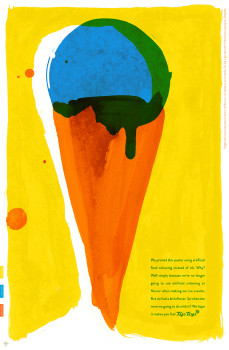
Tip Top extends ‘Feel Tip Top’ campaign with outdoor poster execution
 Tip Top have extended their Feel Tip Top campaign which highlight’s the brand’s move to only natural colours and flavours in their ice creams with an outdoor poster execution.
The limited run hand screened posters utilised synthetic food colours instead of ink and complement a wider campaign created by ColensoBBDO.
Tip Top group marketing manager Minna Reinikkala said in a statement: “Tip Top is nearly finished changing all our recipes to only natural colours so we have some leftover ingredients that we don’t want to use anymore. It’s fun to see them being used for something so creative.”


The apostrophe in “highlight’s” is also unwanted
Hmm. Whilst I agree with the overall direction, I really question the creative strategy on this one.
They have just raised awareness of Tip Top using artificial colours and flavours.
After looking at the ad multiple times enlarged on a large computer screen, only then did I see the sidebar message of staged rollout using only natural colours and flavours.
Why would consumers continue to eat the other ice creams in the range that still use paint, sorry artificial colours and flavours. Wouldn’t you wait until the whole brand has changed over before broadcasting such a negative message?
Would have thought this is primarily a packaging and point of sale message.
Couldn’t you use natural food colouring to print the poster also?
See, the artificial colours and flavours has got me all hyper and overexcited.