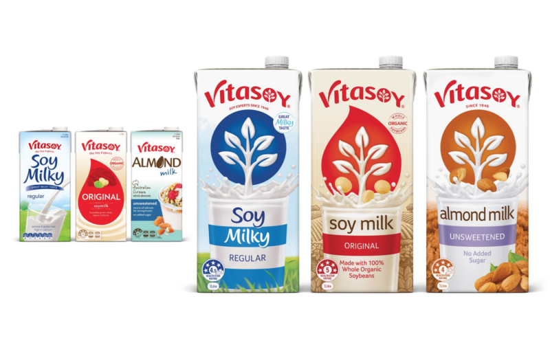
Lion’s soy milk product Vitasoy has undergone a brand refresh with branding agency Believe Branding.
The change in logo aims to simplify the product and improve its store visibility.

Vitasoy’s old and new branding
Be a member to keep reading
Join Mumbrella Pro to access the Mumbrella archive and read our premium analysis of everything under the media and marketing umbrella.
Become a member
ADVERTISEMENT

Like the idea of unifying the set, just dont get why the red variant is a droplet, not a circle…
Hi Brand Guy – the droplet is a legacy element from the old packaging and will be phased out in the coming months. Then the circle will be added and things will appear as orginally intended.
The Droplet was one of the few recognisable elements from the old design and so needed to be treated with care.
Horrible choice. Vitasoy was a staple for me for 2 decades and was he best soymilk on the market. I’ve been looking for Creamy Original and Holly Nog for awhile and just like so many other once great companies, they pulled the rug out from underneath loyal customers and changed their product. Try thinking about your longtime customers who rely on your products instead of strictly catering to people who don’t even buy your product. This isn’t an upgrade, you’ll be out of business soon.