Opinion

Why did Google just change its logo?

When Mumbrella discovered that Google had made what seemed to be a small change to its logo this week, we went to Rich Curtis, CEO of FutureBrand Australia, to interpret what that meant in design language. For the record, the change involves the primary colours inside the "G": they used to be separated by hard lines, now they blend into one another with gradients.

Why did Google change its logo?

Nobody seems to know.

Presumably the people at Google know, but they’re not telling.
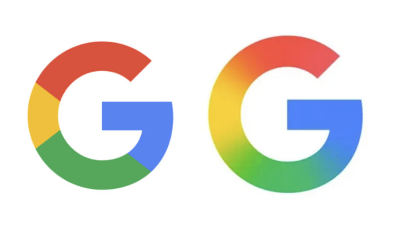
The old Google (L) and the new (R)

The last time Google’s brand identity made a change like this, the company was much more forthcoming about the strategic reason behind it: the need for a brand identity that could extend beyond desktop-based Search to embrace a broader suite of platforms across a broader range of devices, in particular mobile devices.

At that time in 2015, the company even produced this video as part of their efforts to reveal the change.

The big reveal that often accompanies a big change to a brand was this time nothing more than one part of an update to the Google iOS app. In other words, it could be mistaken for a software patch. After all, the new logo has not been updated on Android and other platforms, or at least not yet.

No big reveal this time. No corporate communications. Instead, we’re left guessing.

Is it a long overdue response to the criticism of Google’s minimalist, flat-design aesthetic? Or, is the gradient in the new logo some kind of skeleton key to unlock Google’s ever-expanding world via a contemporary design feel?

Whatever the reason, there ought to be one.

But I’ve been scouring the Internet and all I can find is conjecture in the place of any comments from the company.

Reading between the lines, I’d suggest two hypotheses.

The first is that the gradient in the new logo mirrors the recent design of Google’s Gemini logo. The hypothesis being that this is the next step in a brand evolution kick-started by that design and its gradient effect. In the words of design company Strohl, reflecting on their approach to designing the Gemini logo: “These colours dance and evolve, perpetually shifting shape. This dynamic visual showcase mirrors the ever-evolving nature of the AI, embodying its continuous growth and adaptability.”

The Gemini logo with gradient

In which case, is this a signal aimed at changing how the Google brand is perceived and performs through the lens of Artificial Intelligence? Perhaps platforms and products featuring the use of AI will now be distinguished by the gradient effect as tech shorthand for ‘new and improved’, while others without AI languish in the flat-design world?

The second hypothesis is that Google is reluctant to make too much of a fuss about the design of this new logo as the company is perceived by some to have been slow off the mark on all things AI. Consequently, this design simply gets it back to the AI equivalent of square one – and the company will save its media outreach for a time when it has something really big to say. Who knows, this could be a teaser and that could be soon?

But the overriding point to all this conjecture is that whatever the reason for the new Google logo, there ought to be one.

And for that reason to be significant rather than superficial, any change in brand ought to be underpinned by a change in business.

I suspect that Google believes this change is significant (despite the lack of communications around it).

In which case, it is overly simplistic to ask, “Why did Google change its logo?”

The bigger question is this: “Did Google just change its business?”

ADVERTISEMENT

Get the latest media and marketing industry news (and views) direct to your inbox.

Sign up to the free Mumbrella newsletter now.

"*" indicates required fields


SUBSCRIBE

Sign up to our free daily update to get the latest in media and marketing.