
‘You can’t taste the gin through Instagram’: How Weave developed Four Pillars’ new label
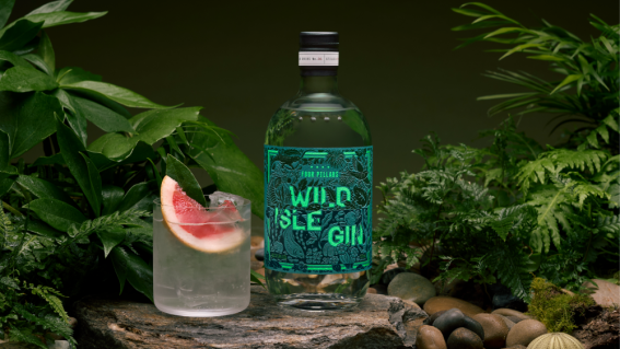
Wild Isle Gin
Gin distillery Four Pillars has engaged Weave — an independent design and branding agency — for the art direction and label of its new “Wild Isle Gin” product.
Specifically, the agency’s work consisted of designing a fresh label for the new gin, as well as “developing art direction for product photography” to launch the product.
In a media release, the agency’s creative director, Darren Song, explained that the label was crafted to symbolise New Zealand’s Great Barrier Island — the location of Four Pillars’ distilling partner, Island Gin, and the new product’s central ingredients — 90km northeast of Auckland.
“We wanted the label to capture a sense of discovery to reflect NZ’s Great Barrier Island where the gin’s key botanicals originated from,” he said.
According to Dan Cookson, Weave’s co-founder and executive creative director, Four Pillars briefed the team at the end of March 2025, with work on the art direction kicking off in late May.
Weave’s team approached the Wild Isle Gin label from two design lenses: shelf presence and in the hand. There was also a day and night element that was integral to the project.
The label the agency crafted is an amalgamation of greens, blues and teals, with the series’ signature border and logo. In addition to lettering, flora and fauna found on the island’s forests and oceans, “alongside the hero botanicals”, are also featured on it. With so much going on visually, it was important to create a cohesive image.
“They’re analogous colours … So they’re all in the cooler tone of the color spectrum that stretch between a true green, a blue green and then a blue,” Cookson told Mumbrella.
“Because of those analogous colors it also means that you can achieve a degree of subtlety throughout the label. Because there’s so much detail going on, if those colours were more contrasted, they would just, it would be a hot mess.
“But, because they’re very close to each other in tonality, it means that, things from a distance can feel quite cohesive, even though there’s so much going on in the label.”

Wild Isle Gin
Weave added glow-in-the-dark details to the imagery to give it “an unexpected textural dimension”. Overall, it’s meant to capture two sides of Great Barrier Island — the rainforest during the day “and a haven of discovery by night”. It’s a creative element that gave the team some doubts and required them to shake-up the typical project timeline.
“ There was obviously some challenges with the glow-in-the-dark bottle element which needed us to be working — almost from the moment that we decided on that — working really tightly with the printer,” Cookson said.
“Which is odd usually talking to printers right at the end, but for us it was right at the beginning. But also during that process, the other kind of element was that we were a little unsure all the way through whether the glow and dark, the dark was even gonna be an option, from a cost and a production point of view.”
To ensure that their work wasn’t wasted, Weave designed the label “to work with or without that glow-in-the-dark element” while still containing “that sense of specialness”.
“We learned through our research that Great Barrier Island was recognised and awarded the Dark Sky Sanctuary status in 2017, making it like the ideal spot if you are into stargazing, constellations, galaxies – all that kind of stuff,” Cookson said.
“It wasn’t just a cheap trick. The idea of the glow in the dark was really to capture that sense of place, being reflective of its beauty during the day and at night as well.”
Wild Isle Gin is the sixth in Four Pillars’ Distiller Series. The range began in 2016 with the launch of the Spanish-inspired Cousin Vera’s Gin. Other members of the series include the Japanese-influenced Changing Seasons Gin and the Indian-backed Spice Trade Gin.
Weave has been Four Pillars’ creative partner across all six gins.
“We’ve always worked in a way where we’re amplifying storytelling for these [brands],” Cookson said, “but more so trying to capture the story behind the gin or the specifics of the place from where the gin is inspired, or the botanicals or the flavour profiles.
“So always just trying to pick the most relevant story. Bring that to life on the label in a way that makes it feel really special and unique and ownable, and something that people get excited about, because you can’t taste the gin through Instagram.”
The new Wild Isle Gin can be purchased from the Four Pillars Gin distillery and website from September 18.
Agency Credits
Creative Director: Darren Song
Illustrator: Erica Lee
Production Director: Matt Bowman
Account Director: Ashley Ng
Photographer: Tomas Friml
Stylist: Marsha Golemac