New Australian War Memorial centenary logo ‘lacks spirit’ says designer
![]() A new logo from the Australian War Memorial (AWM) for its World War One centenary program has been criticised as looking like “it was put together in clipart”.
A new logo from the Australian War Memorial (AWM) for its World War One centenary program has been criticised as looking like “it was put together in clipart”.
The new logo, a white silhouette of the Canberra memorial on a black background, was revealed earlier this week by the AWM’s director Dr Brendan Nelson, with the organisation saying it derives “from the history, mission and purpose of the Australian War Memorial” while also reflecting symbols of WWI.
Designworks Sydney creative director Derek Samuel said Designworks Wellington office has recently worked on the logo for New Zealand’s centenary commemorations, and described the AWM effort as “ill conceived”, adding: “It looks like it’s been sourced from clipart.
“It seems a shame that for such an important piece that it’s at that level, there’s absolutely no spirit of what that’s representing in that at all, which is a real shame.”
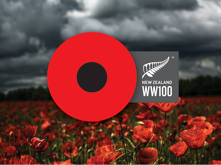 The Designworks logo for New Zealand’s commemorations feature a poppy shape, which the agency says “can also be read as an open eye, a target, a bullet wound”.
It is unclear whether the AWM used a design agency for its logo, or produced the design in house. They had not responded to request for comment from Mumbrella at the time of publication.
On the Australian logo Samuel said: “I don’t think it’s had any real strategic thought of how that works or actually as a system that can be used for the period they’re celebrating as well which I think is a real shame.”
“I think that with that they’ll have trouble expanding and bringing the program to life with the identity they’ve currently got.”
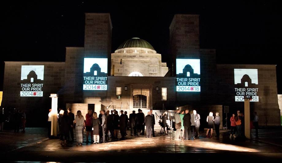 The logo was unveiled earlier this week at an event in which the memorial’s director Dr Brendan Nelson launched the centenary of the First World War program of events. It was projected onto the memorial for invited guests, media and the public.
Nelson said in a statement: “This is an opportunity for Australians to look back on this momentous event in world history, to understand the impact it had on our nation, and to remember the service and sacrifice of our First World War soldiers.
“The Memorial is a key commemorative body in Australia and is thus committed to providing a respectful and dignified program of events.”
The logo features the iconic poppy which the Australian War Memorial says is “a symbol of commemoration and sacrifice with a history tied to the Armistice of 11 November 1918”. Poppies are also synonymous with the Australian War Memorial, with visitors each year placing the flowers next the names of relatives and friends on the Roll of Honour.
The 2014-18 references refers to the Australian War Memorial’s centenary program which will run throughout this period as they recall Britain’s declaration of war on August 4, 1914 and the signing of the Armistice on November 11, 1918.
The text ‘Their Spirt Our Pride’ on the logo refers to words penned by Australian World War I war journalist Charles Bean: “Here is their spirit, in the heart of the land they loved; and here we guard the record which they themselves made”.
A silhouette of the Memorial dome and building completes the logo, tying the logo into the Australian War Memorial brand, according to the rationale.
Thank you!! It’s terrible.
Sour grapes?
New Zealand’s one is better, but that’s not saying much. Ugh.
a hopeless peice of work.
As someone who’s had some past connection with promoting the AWM’s image, I can say there is no internal design capacity at the Memorial. Perhaps that’s the problem.
Sounds like a case of sour grapes.
Please understand the broader topic the AWM effort brings together the threads of commemoration from those far flung theaters into the single focus. The cornerstone of that commemoration should always be the War Memorial. It’s an instantly recognizable symbol of those service men & women’s sacrifice & a tangible reference to the 100 year anniversary.
The NZ treatment doesn’t show true understanding the poppy is important though it’s not the essence & each country should align themselves to that important icon in their psyche. It’s aesthetically dramatic but could almost be a teaser for a new Brad Pitt Zombie flick or an AB 100th Anniversary tour of France.
It’s terrible but I don’t think the “bullet wound” design is much better.
It’s almost identical to the canadian poppy badges.
It’s a lot of money for two circles. I don’t think it’s bad but it’s not so great that
they’re in a position to slag off the Australian one
Well I think the AWM logo looks better than the Kiwi one. That looks like an ad Target could use should they wish to expand across the ditch….
It needs more iconic links to Army. It should have included The Rising Sun for example, as opposed to the Australian War Memorial
The transient style and jolting nature of this logo perhaps reflects the fact that a logo isn’t so much about what appeals to everybody, but seeks to address a particular audience and evoke a particular response. I’d suggest that perhaps this logo successfully resonated more with the dissonant youth culture of today – the very people who are becoming increasingly disconnected from the valiant history of our ancestors.
The NZ bloodshoot eyeball doesn’t really communicate anything, but the new AWM logo instantly tells a story.
It’s not the most creatively satisfying piece, but since when have logos been about beautifully adoring the hallways of our homes like artwork?
“can also be read as an open eye, a target, a bullet wound”. That’s reassuring.
I attended the launch the other night and believe the logo will work in the context of the broader commemoration program. The logo is the logo but for mine it will be relevance and impact of the story telling and events that will determine the success of the commeroration.
A news story about a logo complete with a whining Kiwi! Time to focus on our soldiers. Get over it!
It’s truly a shocking logo and the ‘clip-art’ comment is spot on.
It’s clunky, lacks style and at best, is a starting point concept for any designer worth their salt.
The Australian War Memorial is a very strange place. I was unemployed in the 1980s and was given a temp job in the mail room and I was on a three month contract. After a few days I was told my contract was being cancelled. I have never set foot in the place since then.
Any words provoke controversy. I can more or less come at ‘spirit’ but to try to imply that ‘pride’ is the only legitimate emotion available to us today is crass in the extreme. What about ‘sorrow’, ‘regret’, ‘anger’, ‘shame’, ‘pity’, ‘respect’, ‘wonder’, to name a few. War and all it connotes are far too complex to be compressed into a logo. Better not to bother; give the money to worthwhile charities for wounded service people.
I think it looks great .. the awm created a design that doesnt stray too far from what the public know, its familiar with a profound acknowlegement to those that served and to what the awm stands for. “A memorial for those lost to war”. nothing fashionista in that.. its not some blank canvass to express your own interpretation on.. the AWM did a good job .. nothing about it looks like clipart.. shame on you derek. If the kiwis are happy with theirs then thats all that matters.
The design industry is even more bitchy than pr.
Me? I think the logo looks great.
Ps it’s just a logo.