Design industry association unveils new logo
AGDA, the industry association for Australia’s graphic design community, has unveiled a new logo to help increase awareness and membership of the Australian Graphic Design Association’s NSW chapter in 2013.
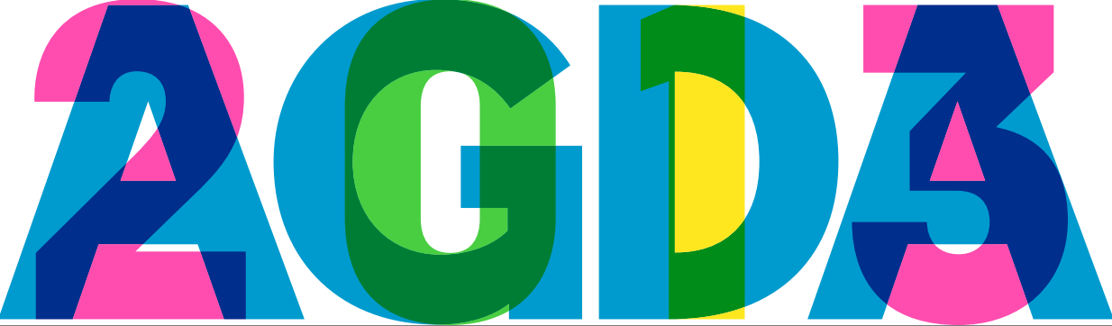
AGDA’s 2013 logo
The logo is a continuation from last year’s ‘AGDA NEW’ campaign, launched to combat criticisms that the organisation lacked purpose and relevance.
The logo was created by STW Group-owned brand agency Houston.
The agency’s CEO Stuart O’Brien said the new design “brought out the sense of community and collaboration within our design industry, while highlighting AGDA’s commitment to bringing people together”.
“We thought long and hard about what collaboration means and came to this idea around the ‘co’ word – which is all about two (or more) elements coming together. The design idea that best spoke to this is a series of interconnected fluorescent lines; representing the network, and the engaging possibilities of design collaboration,” he explained.
The logo is “a bold, eloquent and concise design that is simply an engaging medium for everything that is happening this year for the association. The aim was to catch people’s eyes while demonstrating that our industry speaks for itself,” he added.
Nothing like an annoying, virtually unreadable logo to get your message across….
I would hate to see the designs that were rejected if this was the front runner.
Headache!
yuk
Hahahaha of all the possibilities, I am so glad that it is the Graphic Design Association that has this godawful logo. How humiliating.
what happens next year?
Nothing like a challenging, forward thinking design piece to rattle the nay-sayers
This article needs a correction. It is NOT the new logo for AGDA, it is a state based campaign for the NSW chapter only.
Mumbrella has it’s reporting incorrect. The logo as seen above is part of the AGDA NSW campaign for 2013 and is engaging solution in context of the whole brand identity rollout by Houston. The works NEW and NEW SOUTH WALES sit with the mark seen above. The idea of collaboration and connecting and well executed. The comments seem to lack any intelligence for design and maybe a good look at leading branding houses like Pentagram might help educate those few. Check out agdanew.com.au
Thanks. If anyone has anything intelligent to write please tweet @AGDANEW
Not conducive to the colourblind folk.
Stared at it for yonks.
And still couldn’t see the hidden image.
Hate that 3D optical illusion picture stuff…
^ Lol
Is that you rob?
@Glen Barry, although my comment arrived after yours, from a user experience angle (both print and web) I feel my input is both intelligence and experience based.
I can’t see “NSW” in there anywhere?
Familiar much? http://clemenger.com.au/media/.....rt2011.pdf
The most exciting thing is to see the comments!!!
Appreciate the commentary. The article and branding is being correctly updated as I write. KP, should use your full name, happy to have an in-depth conversation with you around intelligent branding and experiences. The AGDA NEW launch at The Local Taphouse last week was a great success and the brand experience brilliantly brought to life by the Houston team as it was by InterBrand last year. We are very lucky that synch great Sydney design studio’s are collaborating with AGDA to bring great experiences to our members and design community alike. We welcome everyone to come along and be inspired and connected at our events and gatherings this year. I hope to see as many designers in the industry as possible collaborating. Cheers and much appreciated. Join up at AGDA.com.au
Typo’s are not my fault.
bright, bold and different with a concept behind it – i like it
@Derrick…bright and bold it may be but different it is not.
IT BURNS!!!
I might be missing something but this is truly f#cking terrible… No, terrible’s a compliment; more amateurish, like it had been done by a student with zero experience.
If it was used as a heading, very large, on a poster, it would be ok. But down smaller, it is virtually unreadable, becoming a graphic device rather than a logo. That’s my opinion as an art director who has done a lot of branding and logos, but I am interested to know exactly how it will be used. And as a creative director I worked with used to say, “If you have to explain a logo, it’s not doing its job”.
Dear Stevo,
In fact you are missing the story- but not your fault. This article is totally wrong- has missed both the detail of the campaign and it’s role. This is not a new logo for AGDA and the excellent journalism of this site has totally misrepresented both the work and the idea behind it- other mags- sites – blogs- have at least been able to get it right.
To those others so articulate comments on this site – you are what makes this industry so wonderful- and I am sure your own talent and results in this market have made such impact on us all. I have never ever commented on an industry tabloid- but the blatant mistakes of this article and then the ignorant associated comments for a industry love job really shows the ‘type’ of person that throws nasty comments around- thanks Glen for your public support and of course being one of the people that gets out there and does things for our industry – just doesn’t sit commenting about it.
People are saying nasty things because it’s very difficult to make respectful, constructive comments about this logo.
1) The “CMYK overprint type thing” is incredibly trite. It’s worse than when everyone was using concentric rings and pointless squiggly lines a few years ago, and this got tired long before then. Sadly, this is all there is; there is not one remotely original thought in the whole piece.
2) It’s illegible. Why? Type design requires an incredible knowledge of design and typography. Most designers can’t, and never will create anything more than a halfway respectable font. I’m surprised that a graphic design association would choose to shit all over these people and their work, by rendering it pointless.
The new visual identity mark is a great vehicle for the often not heard wit and piff that exists within our industry.
Colour theory 101:
Cool colours recede – warm colours project.
Therefore this logo reads as 2GD3
Idiots.