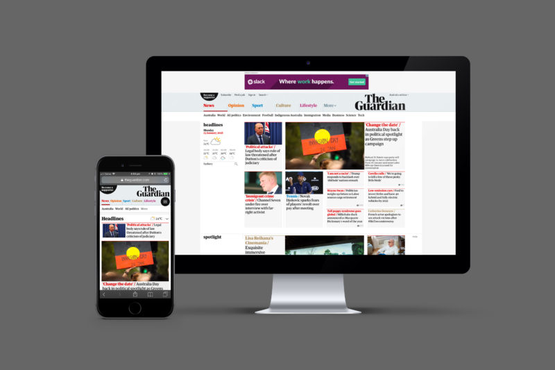
Guardian unveils new look for first time in 13 years
News masthead The Guardian has redesigned its masthead and tweaked its logo for the first time since 2005.
The redesign – which will roll out across its UK print title and its global digital properties including The Guardian Australia – comes just over a month after Guardian editor Katharine Viner revealed the UK newspaper would shift from a Berliner format to tabloid from January 15, in an attempt to cut production costs.


Nice job. Keep fighting the good fight and exposing the rot in our society; you are Guardian’s!
THANK YOU …for years I have put up with “The Tabloids”…a mostly right wing or at least partisan bunch of glorified TV listings that hardly informed me but was at least easy to read in a Cafe, Car or Citchen…(sorry but it had to be done)
Now I have a quality paper that doesn’t involve me knocking my coffee over my toast… You say the redesigned type face makes the print easier to read… does it? Don’t know it has been a while sing I “vardered” (Round the Horne) the paper other than on line so I cannot tell but… it is easy to read. The overall format is good to i.e. a place for everything and everything in it’s place.
A few cartoon strips couldn’t hurt but you now have (even at £2) a new regular reader… WELL DONE and Thank You