News

Schwartz Media redesigns The Monthly

Schwartz Media’s The Monthly magazine has been redesigned for the first time since its launch 12 years ago.

The new layout, which Schwartz describes as “spacious” and “vibrant” aims to improve the reader experience.
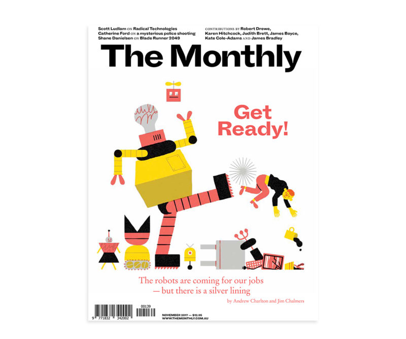
The new look design of The Monthly

In a note to subscribers, The Monthly’s editor Nick Feik noted there would be some aspects which would take time to get used to.

The Monthly’s previous design lasted 12 years

“That’s only natural; like a pair of slippers, the old format had grown comfortable,” he said.

“But what is regular and cosy can become, well, routine, and in our judgement that time was approaching.”

The previous magazine design

The new design will still the magazine’s two column layout retained. And regular items including The Nation Reviewed, Essay and Arts & Letters – will remain.

The Monthly’s new design

However the new layout, created by Public Office and Dinamo type foundry in Switzerland, will include a new bespoke font.

Known as ‘Schwartz’ Grotesque, the new font will appear in the masthead and in varied forms through the magazine.

In June, The Monthly magazine announced it would increase its online art and culture reviews, in an attempt to counteract the decrease of media coverage elsewhere.

Schwartz Media is one of Australia’s biggest independent print publishers. Owned by developer Morry Schwartz, the company also publishes The Saturday Paper and Quarterly Essay.

ADVERTISEMENT

Get the latest media and marketing industry news (and views) direct to your inbox.

Sign up to the free Mumbrella newsletter now.


SUBSCRIBE

Sign up to our free daily update to get the latest in media and marketing.