‘The enemy is replication and referential behaviour’: Branding lessons from the return the Burberry knight
British luxury house Burberry made headlines this week after a dramatic overhaul of its branding.
The rebrand came under the direction of Burberry’s new chief creative director, Daniel Lee, alongside a new campaign rolled out across consumer-facing channels.
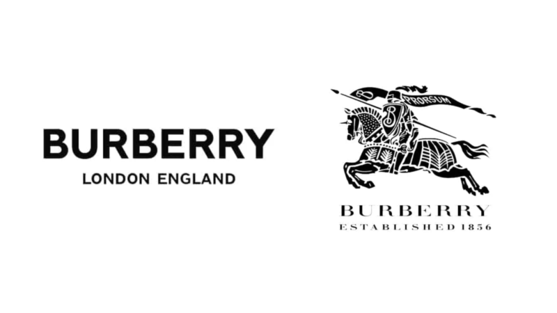
However, it was the new design that attracted the most eyeballs, as the brand backtracked its logo and presented a renewed version of its heritage Equestrian Knight graphics. The blocky typeface was also scrubbed and replaced with a serif font.
This change was accepted favourably by the public as it went against a seemingly homogenising brand design trend that started to root in many sectors.
Co-founder and creative partner of Fabric, TBWA’s fashion and retail specialist agency, Keenan Motto said: “The ‘sans-serification’ of heritage brands has created a sea of sameness within the fashion category.
“YSL (Yves Saint Laurent), Balmain and Berluti all fell victim to the trend that stripped the identity from these brands in an attempt to attract new audiences.”

A side-by-side comparison of some logo designs. Source: VelvetShark
In Australia, one may think of the A-Leagues rebrand in 2021 which looked suspiciously familiar to some existing logos.
CEO of FutureBrand, Rich Curtis, added: “The homogenisation of brands has become a digital curse, brands robbed of their distinctiveness in the name of seamless experiences that are as friction-free as they are forgettable.
“It’s genuinely interesting to see Burberry bucking a trend that it fuelled with its own minimalist rebrand in 2018.”
With that said, rebranding is still a risky business. Last year, the Bureau of Meteorology was under the spotlight for its rebrand to simply “The Bureau” and request to stop being referred to as BOM. It triggered a public backlash so severe that the government agency had to revert the decision, and said people can refer to the body “in any way they wish”.

L-R: The Gap logo, now and the redesign in 2010
Motto added that the “Gap-gate” of 2010 also comes to mind. The redesigned logo lasted six days before the fashion company decided to reverse the decision.
“The attempt to modernise and rejuvenate the brand was too dramatic, the new mark strayed too far from the established brand world. It was completely inauthentic, not landing with new and younger customers, and turning off its loyalists,” Motto said.
While there are a few learnings from the Burberry success, brands need to keep in mind that branding is not just a logo.

Keenan Motto
“An extended brand language and art direction play a role in a successful rebrand, extending beyond just the visual identity,” said Motto. “Beyond a brandmark, brands need to consider the entire brand world – from values and behaviours, to internal culture and customer experience.
“Further, if the objective of a rebrand is to appeal to new audiences, brands need to protect their current audience’s interest – deviating too far from brand roots risks alienation, which is why returning to heritage often makes so much sense at rebrand.
“The enemy is replication and referential behaviour, creativity should always be protected and championed to drive true differentiation.”

Rich Curtis
Additionally, Curtis said that adopting generalising trends is a quest set out for failure, as rebranding “must mean something different and distinct to each and every business, product or service”.
“In fact, branding plays a much bigger role in the choices that customers make in the luxury sector than it does in the finance sector,” he said.
“Just because the brand is big business for Burberry, it doesn’t necessarily mean the same is true for yours – what Burberry seems to understand is the correlation between its brand and its business. Do you know how your brand creates value for your business?”
Have your say