Cocogun’s ‘am dash’ launches as a new symbol for human-made writing
Indie creative agency Cocogun has designed a free punctuation mark to help distinguish real writing from algorithmic text.
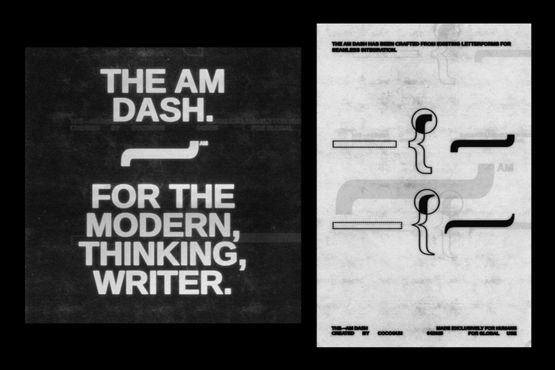
The announcement:
Inspired by Descartes’ centuries’ old maxim “I think, therefore I am”, the am dash is free to download and use by writers everywhere, via theamdash.com. It’s available in two new, tailored typefaces: Times New Human and Areal.
For generations before generative text, writers have used the em dash to hop between thoughts, emotions, and ideas. Dickens shaped his morality tales with it, Woolf’s stream-of-consciousness flowed through it, Kerouac let it drive his jazz-like prose. Today, Sally Rooney threads it through her quiet truths of the heart and it’s a treasured tool in the belts of journalists around the world. In a more everyday context, we’ve used the em dash to craft emails, make social post copy well-structured, and punctuate to-do lists.
But this beloved punctuation mark has become a casualty of the algorithmic age. The em dash has been so widely adopted by AI-generated text that even when used by human hands, it begs the question: was this actually written or apathetically prompted?
So, today we’re launching a new punctuation mark: the am dash.
The am dash enables writers of all kinds, from journalists to authors to copywriters to take back control. It’s completely uncommercial, of course. A symbolic gesture of human over machine. A call for less prompting and more provoking. A simple way we, as writers, can make ourselves heard.
The battle for the soul of writing is in full swing.
The ChatGPTification of writing is starting to look like a heinous crime we’ve enacted upon ourselves. We’ve gone from automating our timesheets to outsourcing the stuff that really matters. And in the quest for expediency, we’re sleepwalking across the Rubicon into some dark netherworld where intelligence, beauty and craft is sacrificed for the ability to spew out a half-baked, mistake-ridden report/blog post/article in seconds. Speed over quality. Efficiency over eloquence. Slop over soul.
The am dash stands against this. It represents a landmark moment in the history of writing. It serves as a symbol of real pondering, genuine daydreaming, and true editorial wordsmithery. A small but powerful testament that the words you’ve written are unequivocally, certifiably, and delightfully your own. The battle for the soul of writing is in full swing. And the human fightback starts here.
We’re launching the am dash initially via two new, tailored typefaces: Times New Human and Areal, available to download and use alongside your custom fonts. Find out more and download the fonts at theamdash.com. Follow the journey on Instagram at @theamdash.
Source: Cocogun
Keep up to date with the latest in media and marketing