Ikon Communications rebrands with new logo and positioning
WPP’s Ikon Communications has rebranded with a new logo and positioning.
Created by fellow WPP agency Landor, the new branding aims to match the “dynamism and flexibility of Ikon and its people”.

Ikon’s old logo
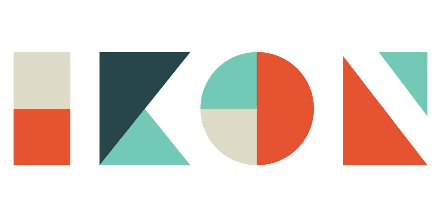
Ikon’s new logo
Before everyone piles on here I’m just going to say that its an improvement and I like it.
If you have some witty snide comments about why it’s actually crap then congratulations to you, you’re clearly awesome.
Defensive before anyone has said a word. Not a good sign.
FWIW I think both logos are unattractive but it’s just a logo I guess.
Ya kidding.
This is great work.
Really flexible and up to date.
The animation on the website brings it to life.
Nice work Ikon and Landor.
We recently went through a re-branding exercise, and the first attempt was this neo-retro abstract brand, that was way off the mark. We were told, abstract is on trend, and a great way to communicate the
5 ways we did business. Yep, exactly like this.
We chose a different path.
Love it
Nothing says just won a supreme court case against a former client like a NEW LOGO Y’ALL!
At least it doesn’t look like a Japanese company any more.
I really like it. Huge improvement.
A good showcase of their creative expertise
Disaster. It’s not clear that it even says IKON. Which is the purpose of a logo. The work, the strategy and the people should communicate the values – the logo just needs to say ‘IKON’. Which this barely does.
Not clear it even says IKON? Better get to Specsavers.
Blandor at its best
Love it. Well done.
For those saying who cares, it’s just a logo, you’re in the wrong industry…
because it’s crap
Wpp agencies appear to spend more time rebranding themselves than doing client work.
Care factor? ZERO
Cant read it, fail
Nine things they do, obviously won’t be clear to anyone