


The Australian Professional Leagues rebranded earlier this week, going forward as the A-Leagues ahead of the upcoming season.
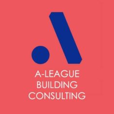
Over in the Festival State, Adelaide Building Consultants reckon there is something fishy going on, with Australia’s top professional leagues taking on a suspiciously similar logo to their own.
Not only that, but Dr Mumbo has seen another logo looking familiar right here on Mumbrella earlier this year, along with a few more similar designs.


In an official statement to Mumbrella, the A-Leagues said: “all the required registrations of the logo have taken place, based on expert advice, within a brand development strategy that has been in process for many months”.
The A-Leagues also wanted to state that while it is a football company, and the Adelaide Building Consultants are…a building company, there is no great overlap, in terms of industries.
I am not quite sure that is how it works though.
There are concerns over at Adelaide Building consultants that with the A-League’s stature dwarfing its own, accusations will be put forth that its own followed the football body’s.
It did however take it in stride, mocking up a logo of its own to post on Facebook.

R/GA was appointed as the APL’s creative and media agency in August, and was contacted regarding the redesign, however heard nothing back at the time of publishing.