Why we should care about Coca-Cola’s new font
Coca-Cola’s global ‘One Brand’ strategy now includes a custom typeface. Uberbrand’s art director Chantel de Sylva unpacks the meaning behind it all.
Times change, so do people’s taste buds. But brands like Coca-Cola is still loved by both young and old – after 130 years – thanks to its ability to keep up with change and still connect with its consumers.
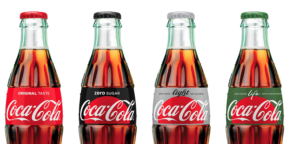
In late 2016, the superbrand rolled out its global One Brand strategy which stated its intention to unify all Coca-Cola sub-brands under one iconic design. Commonly referred to as the red disc, the strong graphic image of white script on a bright red background, became instantly recognisable and a Coca-Cola iconography.
What an absolute load of waffle.
An entire article about a brand using a new font.
Literally no one cares about this.
I disagree entirely. Many people do care, and as the article points out even more people should.
But I’d argue this is a massive missed opportunity by Coke. There is, in my opinion, little to differentiate this typeface from the many many others we’re exposed to in our daily lives. The differences are far too subtle.
I may be proved wrong over time, but regardless of application and media weights I can’t ever see it getting to the point where one could look at a piece of copy – or a headline – and without any other brand cues say “that’s for Coke”.
They should have just used comic sans.
Just because you don’t care, it doesn’t mean others don’t.
Such unhelpful comments should be kept to yourself.
That’s when literally no one cares.
because your an important man at your accounting software firm, not a psychologist 😉
Well I care. Great article.
Maybe a question for Mumbrella:
What’s with ‘Why’ in headlines?
– Why we should care about Coca-Cola’s new font
– Why I’m quitting LinkedIn
– Why 2018 is the year branded podcasts will finally go global
– Why the Trimantium GrowthOps’ acquisition of AJF will probably fail
– Why there will be fewer people working in PR in 2018
All from the front page.
Maybe challenge your writers to write something a little more compelling than a lazy headline fad. Even removing the ‘Why’ is more interesting:
– We should care about Coca-Cola’s new font
– I’m quitting LinkedIn
– 2018 is the year branded podcasts will finally go global
– The Trimantium GrowthOps’ acquisition of AJF will probably fail
– There will be fewer people working in PR in 2018
Thanks Why?, we’ll take that on board and be a bit more creative.
Paul Wallbank
News Editor
Good one!
Just adding my two cents in as one of those who both cares and is interested in when a global brand changes or tinkers with its font and the background around the changes. Also I’d like to think I am literally someone.
Not a fan of the new Coke branding – the pure silver for Diet, black for Zero etc. was far more classy.
Also phasing out Coke Zero is a mistake. Zero is a far stronger brand (and more likely to appeal to the male market) than Sugar Free.