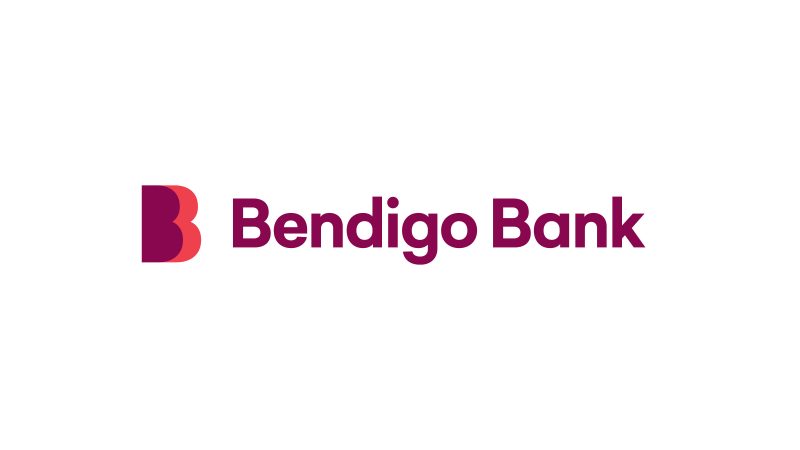
Bendigo Bank reveals refreshed branding, designed to appeal to a younger customer base
Bendigo Bank has revealed its refreshed branding.
Speaking to Mumbrella, Bendigo Bank’s executive for partnerships, marketing and corporate affairs, Alexandra Gartmann, said that the decision to refresh the brand came from an increase in new and young customers.

The new branding was devised to reflect Bendigo Bank’s contemporary positioning
“Because of the sentiment in the market and also some of our uplift in performance recently with really great numbers of new and younger customers coming to the bank, we decided it was a great time as part of our strategy to really tell our story in a different way,” Gartmann said.


this is what happens when you get an ad agency to do a brand design job 🙁
Bloody nice brand evolution. Sharp, modern, simple – still recognisable. Would love to see the whole kit.
This is fine and an improvement on the old branding. Specialist brand agencies have just as many “fails” as wild successes so it’s no wonder marketers don’t bother.
Jeez. I just re-read this article and it is a bit of a stretch for such a poor outcome.
I’m 30 and I like it. I would say they have done a fantastic job. It will no doubt resonate with my generation.
Certainly needed looking at, but personality sacrificed on the altar of a generic contemporary style without any apparent idea as a foundation.
Looking at the website, the change narrative is thin and the new look and feel is generic and lacking personality.
Not quite as bad as the recent BB Baby Bunting thing (which isn’t live on the website despite being revealed 5 months ago – has it been retracted I wonder?) but still a disappointing identity from a brand that could have been so much more.
Such a disappointing outcome for what has obviously taken a long time and a lot of resources; maybe too many poor chefs in the kitchen?
Jeez, some harsh critics. Bank theming is a tough gig, as you get legacy issues along with a desire to attract a new segment. It seems that the client is really happy (which ultimately is what matters). I’m looking forward to seeing what the entire new theme and branding looks like.
Or is it that no one has had a chance to dig at GrowthOps lately?
A logo.
You can’t judge a rebrand on the logo.
Is the actual Bendigo branches – and the complete overhaul they’re doing on that side of things. From daggy to very modern. Lygon St got a huge makeover / moved. The logo when paired with what else is going on with the bank – works very well.
I’m 34 and I like it. Keen to see the rest of the collateral.