


Guardian overhauls Australian site
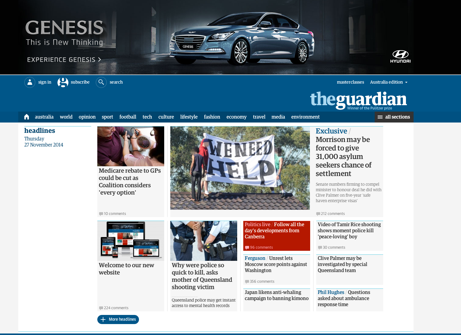
The redesigned site
The Guardian’s Australian site has had a major design overhaul after an 18-month project involving 45 staff and eight months of beta testing with five per cent of its global audience to iron out bugs.
Today the publisher hit the switch on the new version, which sees the homepage move to a “modular” layout allowing users to customise it to their preferences, with Wolfgang Blau, Guardian’s director of digital strategy, telling Mumbrella it also allowed for more customisable ad slots.
Stylistically the site has moved to a serif font for its editorial content and increased the size of the text, however native advertising will be “clearly labelled, and shown in a non-serif font as we do not want to try and trick the readers”, added Blau.
The new site has been turned on in the Australian market second, after being rolled out in the US at the end of October, but Blau said it was important for the publisher to study how Australian audiences reacted to it as they are “more similar to the UK readers than the US readers”.
Blau said it was important to overhaul the site, which last underwent a facelift in 2007, to update the code base, improve load times and make life easier for journalists, with more flexibility around page design and layouts now available.

Blau
“Editorially we have many reasons for giving our readers more reasons for using us more often,” he said. “We would rather have one reader visit us twice than two readers visit us once. With two visits from one person there’s a better chance of building a relationship with those people, more chance they will want to leave a comment, become members and come to our events.”
He pointed to research which showed around a third of the site’s traffic globally entered through the homepage, a high proportion of readers, but admitted the notion of the homepage as it currently exists, with editors controlling what readers see where, is obsolete.
The new site allows consumers to customise which sections they see, “why if someone doesn’t like sport should they be forced to scroll through the sports section every time” added Blau.
On the issue of loading Blau said it was proven through research people were affected in their decisions on whether to visit a site or not by “milliseconds” of difference in wait, whilst search engines now rank sites based in part on their load times. “At the end of the day people want to read our excellent journalism, they don’t want to wait for it to load,” he added.
The new site also provides “less clutter” and more flexibility for ad units, with full-width ads now able to be slotted in anywhere on the page, “something no other major publisher in the world can do” according to Blau.
“What we have found is the view time of the ad is becoming increasingly important, as is load time,” he said. “Where most sites have full width ads just at the top or bottom most people reach a page and scroll straight away, but not many reach the bottom of the page so these are being lost.”
In terms of site navigation Blau said while a third of its traffic still enters via the homepage they had worked hard on how they helped people navigate the rest of the site. To this end it is developing more targeted recommendation which will look at where the reader has come from to show what else might interest them. For example someone clicking through from social media might then be shown the other most popular social media posts from the site as well as recommendations.

An example of a native ad on the new site
Whilst there has also been controversy over native advertising looking too similar to editorial on some sites Blau insisted The Guardian wanted to make it as different as possible.
“It’s never been an issue between the editorial team and the commercial team, there’s always been agreement that the we will do best by our clients and our readers by being transparent as to what’s editorial and what’s client funded content,” he said.
“There will be a different font for text articles, and every video will be marked ‘brought to you by’. Not only do we have a strong interest in protecting our credibility, but also our clients as well. They don’t want their high quality content smuggled into our readers’ news feeds.”
On top of this the site has the ability to “target ads to tags in a granular fashion”, including with archived content, and based on the context a word is used in. “We have different tags for Paris for travel, and another for politics,” he said.
The new site will also allow editors to pull in more links from around the web, highlighting and aggregating links to the best content they have seen, including from rival news organisations in Australia.
Whilst the global team has had collaboration from international competitors, and will make the source code for the site available for anyone to use on GitHub, Blau admitted its Australian counterparts had not been so forthcoming in collaborating on the project.
He also said they had noticed a large uptick in Australian-related articles being read on its US and UK news sites since the local operation launched, adding to “an increased reach of Australian voices around the world”.
Alex Hayes
topics
Collaboration
Fairfax
International
native ads
News Corp
overhaul
redesign
sponsorships
testing
The Guardian
UK
Us
I know the Guardian has put a lot of work into the redesign of its web site. There is a chance I will adjust to it. But at the moment I find it much harder to discover what is on the site and wish they would go back to the original user friendly site.
User ID not verified.
In terms of layout and design, the old Guardian site was the best news website in the world. The new one is unusable.
User ID not verified.
I must say my first reaction is to agree with Lindsay. I find the old scroll down a lot easier to navigate than the zigzag needed with the new design, even if it didn’t look as pretty.
User ID not verified.
Works for me.
User ID not verified.
Horrible move. Much prefer the older design. Whoever was beta tested with this new design must have been working undercover for Fairfax.
User ID not verified.
I deleted my shortcut. The new site is FUBAR.
User ID not verified.
I like it. Much easier to navigate the content than the old, jumbled, confusing layout.
User ID not verified.