


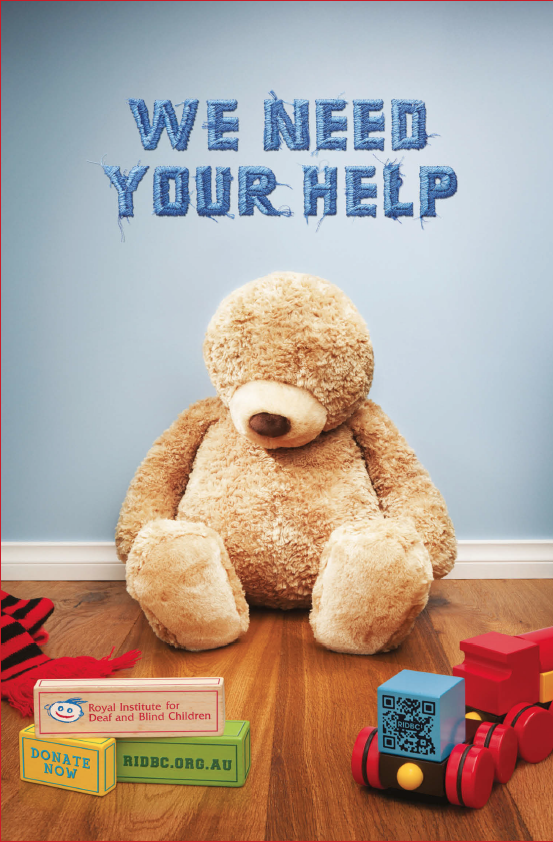
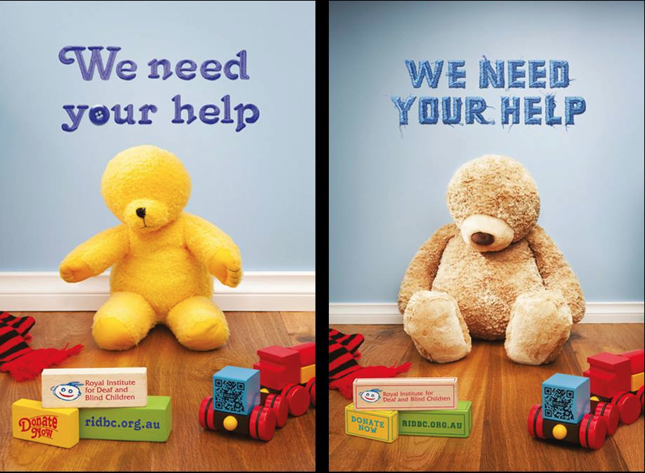
Blind teddies feature in charity poster campaign
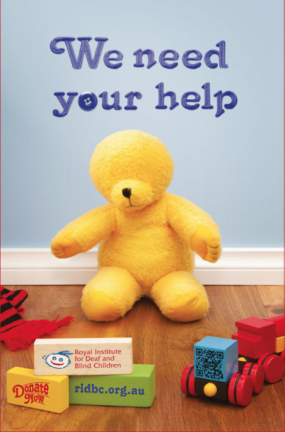
Teddy bears without eyes and ears feature in a new outdoor campaign for the Royal Institute for Deaf and Blind Children.
The campaign has been created by new independent Sydney agency Common Ventures.
The outdoor campaign will appear in media space donated by Adshel at sites across Sydney, Melbourne and Brisbane.
It is the first piece of advertising for the charity, “in a very long time” and an early project for Common Ventures, launched in September last year.
The Common Ventures team of four former Ogilvy Staff is headed by creative director Brian Merrifield.
He said: “The RIDBC does an amazing amount of things for deaf and blind children, and we were given an incredibly difficult brief,” he said.
“Usually non-profit creative can be message overwhelming, so we wanted to go strong with a direct message. But how do you get people to become a bit more aware about what they do without cramming everything into it?
“We had to find something so simple that encapsulated the fact that they help both blind and deaf children. The teddy bear was one of the first ideas that we had and we kept coming back to it because it was so striking.”
RIDBC Chief Executive, Chris Rehn said: “As a charity, RIDBC puts fundraising dollars back into improving and extending our services so an outdoor advertising campaign on this scale simply wouldn’t be possible without such outstanding in-kind support from the corporate sector,” he said.
The Teddy visual is strong but the connection to the RIDBC is so small and hard to see. Seems to miss a trick by making it difficult to work out who the charity is … the charity gets about 5% of the real estate.
User ID not verified.
Amazing – such a powerful campaign.
User ID not verified.
Well I love it. Thumbs up Common Ventures.
User ID not verified.
A great idea, well crafted. Congrats Common V.
User ID not verified.
drove past this ad yesterday…I think it is a great concept, but I had no idea what it was advertising! the RIDBC and ‘donate now’ needs to be bigger.
User ID not verified.
Nice concept but poorly executed. I saw this ad at my local bus stop recently, and I also had no idea what it was advertising. Branding here seems like an afterthought. As mentioned in the other comments, the charity only gets a small portion of the screen real estate, and is tucked away at the bottom. The logo needs to be much bigger than qr code and donate now. The overuse of different fonts doesn’t help either, but the bear is a nice touch.
User ID not verified.