Howcroft: Russia missed a trick with ‘lame’ Sochi tagline
In his latest missive from Sochi Russel Howcroft wonders about the tagline for the Games, and whether Russia has missed an opportunity for a new brand identity.
Vorsprung durch technik. I know I can look up the translation on the Google machine but in the absence of doing this I assume the Audi endline means something like “We are German and we are awesome at technology, that’s why Audis rock”.
With this in mind, it seems such a pity that the Russians have opted for the endline Hot.Cool.Yours. for the Sochi Olympics. Three words, three full-stops. No spaces.
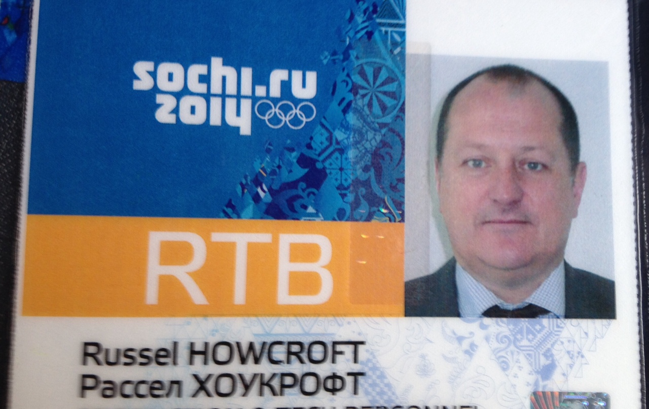
Yes, it’s lame and it gives you the feeling you get when European bands try to make it in English and sing songs with lyrics such as “I’m hot, you’re cool, I’m yours”.
But it’s not a surprising endline; indeed, you can see how they got there. They would have felt the need for the line to be in English, they would have wanted the line to have global appeal and they would have wanted it to explain the Sochi proposition. And I imagine there would have been a number of people with varying opinions on exactly what the Sochi proposition is.
“We’re cool”.
“No we’re hot”.
“Both true, but we do need the world to know we are open and inclusive”. Etc etc etc.
Occasionally great destination marketing makes it into the lexicon; “I heart New York” being the most famous. It was simple in idea and execution, and it was created at a time when the NYC brand needed a serious boost at home and abroad. (When I first visited New York in the 1980s, cab drivers would advise “Get out of the cab, walk straight ahead to your hotel, look at no one”.)
Of course, NYC recreated itself via legislation, development and branding. Sochi represents vision, development and is using the Olympics brand to accelerate the world’s view of Russia. What a pity this has been distilled to a communication idea of Hot.Cool.Yours.
The Russian alphabet is unique and uses the Cryllic script. There are 33 letters, 11 vowels and in type form they look beautiful.
The Sochi branding team should have tried to do an Audi and given the world a Russian phrase and an awesome piece of type design that they, like NYC and the Heart, could have traded off for years to come.
It’s unlikely they will sell many T-shirts with Hot.Cool.Yours. on them, but something like Na Budushee – to the future – could work.
Sochi, after all, is a massive exercise in a prosperous future, which is an idea with global appeal. And in Russian Na Budushee looks like this: На будущее.
Russel Howcroft is general manager for Winter Olympic Broadcaster Network Ten
How about… “Russia: No Poofs Allowed.”
User ID not verified.
Typo – Cyrillic script
User ID not verified.
Couldn’t agree more. I only saw it last night and wondered what on earth is was meant to convey! Sounds like an 80s Coke promo tagline.
User ID not verified.
Hahaha.
User ID not verified.
I was in Russia a few years ago and came across their local sports brand, Bosco. They produced T-shirts that simply said ‘.ru” and looked super cool. So they can do it.
User ID not verified.