Ten reveals first major rebrand in 27 years: Peach, Boss and 10 News First
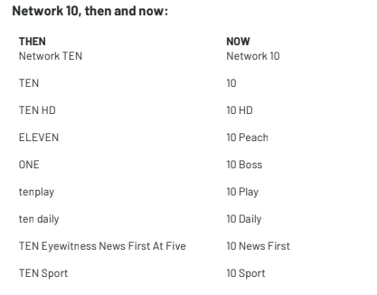
Ten has confirmed speculation about a major network rebrand, revamping its multi-channels to become ‘10 Peach’ and ‘10 Boss’, rebranding its 5pm news bulletin ‘Ten Eyewitness News at Five’ and removing the words ‘Ten’ from its logo.
At the CBS-owned broadcaster’s upfronts on Wednesday evening, Ten revealed Eleven and One would become known as 10 Peach and 10 Boss respectively, with the brands reflecting a ‘feeling’ and an ‘attitude’ respectively.
The number ’10’ is at the forefront of all of Ten’s new assets
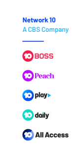
The new branding will also see the word ‘Ten’ removed from Ten’s logo, instead replaced by a number surrounded by a bright blue circle. In addition to the multi-channels and main channel, ‘tenplay’ will become known as ’10 Play’ and ‘ten daily’ will be rebranded as ’10 Daily’. Branding agency Principals is behind the work. Branding for new subscription video-on-demand service, 10 All Access, and new audio business, 10Speaks, was also featured at the Upfronts. Ten’s owner, CBS, is not mentioned in the consumer-facing branding, but will appear on corporate documents.

Ten’s last major change was in 1991
Ten’s new logo
Each brand will also have a different colour, with 10 Boss to be red, 10 Peach to be purple, 10 Play and 10 All Access to be different shades of blue and a green for 10 Daily. The change marks the first time in 27 years Ten has received such a major overhaul of its branding. In 1991, the logo was changed from a gold ’10’ next to an image of Australia.

The logo from 1989-1991

The 1988 logo received backlash, as people perceived Ten as ‘X-rated’
The 1964 Melbourne ATV0 ident, the first of the stations that became the TEN Network
The rebrand comes a year after US giant CBS acquired Network Ten, following a period in voluntary administration. Since then, Ten has also separated from its sales house, Multi-Channel Network.
Ten CEO, Paul Anderson, told Mumbrella it was “time for a change”, laughing as he admitted a number of Ten viewers “probably weren’t born” when the last rebrand occurred.
“It was about making the brand more contemporary, some consistency across all our brands and also signalling that a lot has changed at Ten over the past year. It’s a new era in our business and while some of the stuff has been leaked in the press – Peach and Boss – and there’s been a lot of speculation, we have a very clear strategy around why we’ve done that,” Anderson said.
“It’s very much around demographics and Peach being a feeling ad Boss being an attitude. Nothing to do with gender which has been predicted.”
Beverley McGarvey, Ten’s chief content officer, told Mumbrella design agency Principals was not just hired for a changing of the logos, but also to research and understand what advertisers, audiences and staff expected.
https://twitter.com/Channel10AU/status/1057536977325633536
McGarvey hopes the new branding will communicate the ‘cheeky, mischievous, fun and authentic’ nature of Ten.
On the rebrands of One and Eleven, McGarvey said it was about differentiating the multi-channels.
“The Boss and Peach thing is part of a bigger picture. Really what Boss and Peach were about were giving channel names meaning and that could attract further meaning. Really what it’s about is demographics,” McGarvey said.
“One does and will even more now target older audiences. We’ll play all the CBS content that works really well for that audience – things like NCIS, CSI. The reason they skew a bit older is because it’s about character. Those characters all tend to have that big persona ‘boss’ attitude.
“When you think of someone like Judge Judy and the word ‘Boss’, it is not a literal definition of the word boss, it’s the way she is [talked about] colloquially by contemporary audiences.
“We spent a lot of timing branding Eleven nine years ago, so a lot of the work we did for Eleven still stands, but what we wanted to do was differentiate it. We will push it even younger. We really want Peach to be a feeling… sorts of shows on that are more… you are relaxed when you are watching them and it’s almost a guilty pleasure.”
Across the consumer-facing side of the rebrand, CBS’ name is absent. Anderson said since acquiring the network, CBS has always celebrated the 50 years of brand equity Ten has, never wanting to change or intrude on it.
The newly branded channels and assets
“Right from day one, CBS have never taken that approach. They were the complete opposite in that you’ve got 50 years of brand equity in Australia, in this market, why would we try and change that?” he said.
McGarvey added: “CBS is a very strong corporate brand here – in terms of the advertising community. But in terms of our audiences, it doesn’t have the same strength.”
Principals’ executive creative director, Simon Wright, said the project was about helping Ten find its “mojo”.
“This new identity captures this spirit while looking to 10’s future as an entertainment network that specialises in escapism,” Wright said in a release.
“We worked closely with the brilliant in-house team to celebrate escapist entertainment. Across design, naming and writing, we’ve created a stronger, more unified brand expression to get Ten back to what it’s always done best – being as fun as the programs it shows.”
It’s just Principals, not The Principals.
Minor correction but one worth making so the right agency gets credit.
Hi ‘A’, thanks, we’ve corrected this now.
Why do keep repeating the same seies of shows over& over& over over & over…..(I believe I’ve made my point) again? There are literally thousands of tv shows out there
Credit? More like the agency not give money too.
Peach, wtf. Will there be a mario or bowser?
definitely an in-house job.
WOW – what a very bland boring uninspiring logo. Design agency should have done better.
That logo is not very exciting. Surely they could have designed something that answers the brief and represents ‘entertainment’.
Hard to tell what’s worse, the truly bizarre Boss/Peach branding, or the fact the new logo looks like a lotto game.
One – Ten Boss. For the demographic you are looking at moving shows like NCIS to a subsidiary
channel bad idea. Older viewers less likely to follow such a change than younger audience. 2will all channels be available online?
Thanks. I hate it.
I wonder what the Tenplay logo will look like on mobile. The current logo looks great on my homescreen. It doesn’t have a background too, making it look amazing.
The new logo really suits their new brand position. I like it
Do you work for the agency?
I work for the agency, but I’m not the Tim that made this comment. While I enjoy making the occasional anonymous comment (I like to think witty, rather than snarky), I never do so on our work as I don’t think that’s cool. To the Tim that did though, thank you and I agree 😉
Shenanigans!
Touché Sir
I don’t mind most of it, but what on earth were they thinking with the names and logos for Boss and Peach?!
I’d have to guess they were thinking Super Mario Bros. You have to beat each boss to rescue Princes Peach
At first glance I think looks pretty good – though I’d suggest to the naysayers in the previous comments that the true test of an identity for a broadcast brand is how it works in motion. It might be wiser to hold fire with your derision until we see how it rolls out.
Looks cheap and too playful. Perfect for more stupid reality TV and game shows.
hahahhahahahahahhahaha more cheap tacky reality shows coming our way. thank-god we’re still holding onto aunty – just
Oh my gawd.. I dislike reality TV!!
I can’t even begin to tell you how much it’s irritating me that the Peach logo isn’t peach coloured… am I the only one?
Me too! So frustrating!
Agree
Nope
Shame on you Ten. Those names and branding is significantly gendered. Surely we’ve moved past that.
… er no, it was not “The 1964 Ten logo” it was the 1964 ATV0 Melbourne logo. TEN10 launched a little later in Sydney with its own 10 logo which was totally different, as was the SAS10 logo in Adelaide and the TVQ0 logo in Brisbane.
Hi CJ,
Ten used the ATV0 ident in its presentation last night as it was the first station in what eventually became the TEN network.
I’ve tweaked the image caption to make that clear.
Cheers,
Paul Wallbank
News Editor
Peach? I’m betting that’ll be gone within 12 months. Terrible!
Looks like CBS released some marketing budget and the team at Channel 10 was so surprised they didn’t know what to do with it.
Pretty surprised though, if CBS did release marketing budget, they’ve still come up with something that looks like it was mocked up in Powerpoint. I’d hate to see the headcount hours the agency billed against it vs. what it actually took to ‘Insert New Shape’ and ‘select the fill’ for the circle as Blue
What a load of bollocks.
Paul Anderson is the same CEO that unveiled “Blue Horizon” just over 12 months ago, that was a feel good agenda which oversaw redundancies and cost cutting across the network.
At last night’s presentation he boasted he didn’t know what to do with the billion dollars the Network has after losing the cricket.i have a suggestion!
Give it back to taxpayers , after you cried poor to the Govt for three years and got $30m in tv licence fees relief.
Common CBS, focus on television and not gimmicks.
Zoe you might be too young to know this. But the 1964 logo you show in the article had nothing at all to do with Ten Network branding. It was the ident for ATV Channel 0 in Melbourne. A single TV station. No network existed at that stage. TEN-10 was the call sign of the Sydney station at that time.
Hi Bek,
Zoe’s piece was based on Ten’s presentation at the Upfronts. The ATV0 ident was used as it was the first of the stations that eventually became the Ten Network – Melbourne’s ATV launched on August 1, 1964 while Sydney’s TEN didn’t start broadcasting for another eight months in April 1965.
Hope that clarifies,
Paul Wallbank
News Editor
Hi Paul.
That explains the confusion. Thanks for clarifying and changing the caption on the ATV-0 picture. Sounds like the Ten (sorry 10) Network people don’t even understand their own history!
That should have been “too young to know!”
The new logo looks like it was squeezed out of a toothpaste tube.
Props to the deisgners, they done a good job.
Will the shows bee the same or is it gunna be new shows?
Bring back Family Ties!
First thing to go should be The Project.
“Don’t let them tell you how to think!” “Free your mind!” “Eat a delicious egg and gravy fart roll!”
and that [Edited under Mumbrella’s comment moderation policy] got the new SBS show eh, the one about the genius kids, good on ya love
come on aussie come on! bring back the good days of good shows!
10 Peach? to quote king of queens : “My trainee has a a$$ like a nectarine!” Close but no [Edited under Mumbrella’s comment moderation policy]
New Logo, New names, same crappy shows with most likely the same crappy numbers.
There is nothing in this lot that will make much of a difference to their ratings.
The Peach and Boss thing is ridiculous and stupid not cheeky and innovative. They have not addressed the key problem with Eleven and One. They are made up of 3rd rate repeats and people don’t watch them.
When the new reps go out to present these “new’ channels to market how can they be taken seriously when Neighbours and MacGyver are the marquee shows? Mc Garvie has been programming rubbish like this for years and they are still a distant third in ratings and revenue. A new coat of paint wont change much.
The best announcement from all this was CBS all access, the rest is forgettable……
NFP: you published my correction to my comment. Not the comment itself!! Can you please correct this
Ah hail you grumpy old twits, complaining about the new designs and names, hail.
It looks great. More 21st century
It’s just a logo anyhow. Keep your pants on fellas.
Question:
Will the Big Bash be on 10 or 10 Peach?
Why Peach?
I for one will not be watching 10 Peach, sounds like a ladies channel or one for “tweens”
My neighbour will love it though.
Despite Anderson saying the new brand names have “nothing to do with gender” I just looked at the programming for Boss and Peach and it seems there is some gender bias at play (Formula One on Boss and Sex and the City on Peach). Zoe/Mumbrella – would be good to do some analysis around gender demographics for each of the programs…
I have said this before on this page but I really disagree with Boss being gendered. I don’t watch a lot of FTA TV but looking at the line up I’d watch heaps of their content. I don’t really get the argument that putting sport on one channel makes it gendered?
Like I said it would be interestting to see the gender split on the programs. The biggest issue I have is if they have called a male-skewed station ‘boss’.
Nicole, are you implying only men watch sport and only women watch Sex and the City? Sounds like you’re the one with gender bias at play.
heh heh – well, at least all the red/green/blue colour blind people in Australia still have the number 10 to differentiate between all the new colourful offerings. Oh. Wait…
This is truly rubbish work.
Shame on the agency but even more so on the leaders at 10 and CBS for actually letting this see the light of day.
With Peach and Boss, they have gone in the entirely wrong direction as far as culture is concerned. WTF?
Logo family suite is just bad and wrong and disconnected.
This feels like work that could be at least 10 years past its due date on the day it’s launched.
So bad. Was really hoping this would be good.
Will the King of Queens be on 10 Peach?
Please do not cancel this show!
It is the greatest show on Eleven aka 10 Peach.
Probably the only thing keeping the channel prophetable.
New logo, same long list of white male talent being paraded in their TVC. If Ten really was trying to capture a younger demo they’d realise they need to add diversity to the mix. I can can count the number of women on one hand, while the long list of men goes on and on. And oh so white too.
I disagree. I’d say Ten/10 are the most diverse of the commercial FTAs. Muslim news anchor. Not to mention the thousands of Julia Morris shows…not that they’re any good.
Oh so white yea ok social justice warrior here lol
Its fresh, its a change and its a polish up.
Is it perfect? Who cares…….the content is what counts.
The punter makes a content decision not a logo decision.
Boss or Peak who gives a f**k? Its all about the program offering. That will determine success or failure.
I like it, saw it executed in an ident last night and it looked fresh, playful and felt right. Looks like they’ve been liberal with their brand guidelines which is smart in a constantly evolving and high rotation world. Like I said, I like it and look forward to seeing how it continues to develop on air.
If they got Tenplay to work that would be a plus it’s crap ATM hopeless .like a lot of their TV shows are actually!
So not binary anymore, 01,10,11.
For most of network Tens life its logo was a colour banded square with the number 10 in the middle “First in colour”. This has disappeared from Google and Wikipedia.
WHAT MORONS!!
What incompetent moron thought up, then approved ‘re-branding’ 11 as ’10 Peach’. Is this American?? Are they all that effeminate??
As a male, I enjoy watching Frasier and Becker on this channel, and neither show gives me the vibe that I am delving into my feminine side.
YOU UTTERLY INCOMPETENT AMERICAN NEW OWNERS! How stupid to be sold this crock by the marketing agency you hired. I would rather buy these two shows on DVD then continually get affronted by the fact that I need to tune into ‘Peach’. Maybe you should brand every 10 channel as LEMON because this is a real lemon of a move.
What kind of a man has such issues with his masculinity that he now refuses to watch a channel simply because they named their channel “peach?” Peach isn’t even a feminine word, it is a fruit, and that’s it. If this upsets you, then you have much bigger issues than the name of a channel.
Is this an above shot of a toilet? Yeah it is.
Gary, thank you for your cogent and expertly written assessment.
I’ve loved all your work in your extensive TV career so I pay great attention to every word you write.
Australian television owes you a massive debt that can never be repaid in full.
What kind of [Edited under Mumbrella’s comment moderation policy] came up with these names and logos probably some [Edited under Mumbrella’s comment moderation policy] and to one of the comments the branding has nothing to do with gender so get over yourself
Such a shame. Ten had great logos across the board, great branding, and great identities across all of their channels (at least until they lost all the Fox programming).
The numerical naming of their multichannel always made a lot of sense for Ten – they have _three_ of the first seven channels on TV. Channel 1 isn’t even a primary channel! You didn’t have to go looking in the 90s for oddly named channels like Gem or Mate and flip past horse racing and home shopping, they were just there in the low-end amongst the other ‘regular’ channels. Very easy to stumble across them.
“Peach” and “Boss” is the kind of generic garbage you’d find up in the 200-300 range on American TV running cheap syndication packages, and their programming reflects that.
I am in regional Victoria, here it is 10Bold (not Boss) and 10 Peach
Not able to get these channels in Victoria on Foxtel free to air, even though they are still part of 10 Network.
Foxtel says “they don’t have broadcasting rights to these channels”
IS THIS TRUE?
Did they also think about what the peach emoji means?
Can you please improve the programmes and stop re running re runs….
11 Peach isn’t this going to be confused with 9 Honey which is a pathetic 5 minuted filler in segment on channel 9
Companies pay for this?! They could have done it themselves with a work experience kid. Boss and Peach are laughable so I presumably they will be comedy channels? You can’t get enough shows to fill their criteria of “Boss” and I’m not so sure when you ask people to think of a word for “guilty pleasure” they say “peach”! Lol. Bring on the show lineup for these so we can critique how well they fit their channel description!
“10 All Access” doesn’t give you all access to all 10 or CBS programs either!
A positive from this is that it seems anyone can be in the advertising industry these days and make a living if the customer is drinking the same kool aid…
Why bet its a gender reason
The change from eleven to 10 peach is enough to make me stop watching it.
Seriously how stupid and shallow do you think your viewers are?
I will not watch Peach again!
Congratulations ten you have change the logo and rebranded names update you free to air tv shows for all your channels im over 60 y o male and for years and years repeats after repeats hundreds of times give us back the old shows and stop the repeated rubbish we have to watch my motto use to be channel one the 1 4 ME FIRST ON AIR BUT NOW CHANNEL ONES NOW ABOUT A 5 YES 5 WELL BELOW PAR JUST DONT PLAY STUFF OVER AND OVER BORING LOVE A LAUGH OF COURSE SO HOW ABOUT THE GREAT AUSSIE STUFF OR IT UT NOW A YANKY CONTROLLED COMPANY
GOOD LUCK STEVE THE TV WATCHER
I had to look to see that Boss and Peach weren’t actually aimed at men and women separately.
It’s still off-putting and the obvious first assumption which will turn many people off.
Sadly some guys will refuse to watch Peach because it sounds soft and feminine (Gods this is depressing but there you go) while Boss sounds needlessly aggressive.
It’s polarising however you look at it which makes it a poor choice for this market. I don’t expect it to last long.
They look crap look like work of a 5 year old ten and CBS you should never fix something that is not broken your logo on the corner of the screen stands out like dog balls you should be ashamed of yourself
Blah blah blah blah blah.
Just make One. High definition or “Boss”. HD. And fill it with sport. And only sport like when it was first released.
What a stupid thing to do and what crazy names.
ridiculous name what were you thinking ?
UKTV anyone???
This article is so clearly biased to make the rebrand sound great.
Maybe someone at Mumbrella knows the agency?
I found where they got inspiration from https://en.m.wikipedia.org/wiki/WBNS-TV
Funnily enough affiliated to CBS.
Well, if the non-gender thing was not a thing, then it failed. My second thought after seeing the change on my channel guide was “What? So it a gender thing like 7 Mate?”
Minor annoyance at making an assumption about what I like based on my maleness.
My first thought was “Stupid black box! What’s it done now?”
Australia has spent millions to inspire girls and young women to follow the career and life activities they want and not what traditional society expects and on overcoming domestic violence. And what do Channel 10 come up with – 10 Peach and 10 Boss.
Named after Super Mario Bros characters
Boss and Peach
Agree the new names are ridiculous but I’m more cheesed off that a great show like This Is Us has returned & been relegated to Peach! Meanwhile there is all this other crap on the main channel, any one else sick of reality shows,lol
This is beyond disgusting and an absolute abuse of power. Not only is this objectifying women as a “peach” which is commonly in reference to the booty but it disregards everything that women and men have been fighting for in regards to equality. By creating seperate channels for men and women only implies that it is not socially accepted for both genders to engage in the same interests. By calling men “bosses” and women “peaches” is a distasteful use of stereotypical language and is only creating a bad example for the younger generations which will be amplified due to the large media platform channel 10 holds. This is unnecessary, useless and overall degrading!
Thanks for stuffing up the time of Malaysia Moto GP Boss 81 had it at 1730 to 1900 tuned in at 1455 and it’s over !!!! Thanks a bloody LOT !!!#@#@#@.
10 boss WTF!!! What happened to Motogp?????
There is nothing sexist about any of the new names.
I like the names. I like the re-brand and I like the branding agency.
Great job everyone.
Great work guys. I have had moto GP and V8 supercars on series link record and I have no idea what the hell you did but what you advertised and what you showed. Did not match up in anyway. As it was I watched the v8s but just went to watch the moto gp. And what do I have recorded. Some shit in Africa with lions.. thanks a lot. Checked the v8s and it was some plane crash investigation crap. So happy you re vamped your logos but totally stuffed up your programming…… priorities.. muppets.
Nothing will come close to this Channel 10 promo. Hands down, the best in the history of Australian television:
https://youtu.be/7Je8PqzOlMg
I couldn’t care less about the stupid names, the colours, the logo or whether or not the names are veiled sexist references or taken from a video game; it’s irrelevant. Just stick with numbers and leave it at that. Peach, Boss, Mate, Go, Life, Gem etc. It’s all meaningless. All I want to know is, is the quality of the programming going to improve or will we continue to be beseiged by regurgitated and tired comedies that stopped being funny the 5th or 6th time around and fake/staged reality programes?
Free TV is dying regardless of what they want to call their channels.
I think I’ll stick to the Internet and just watch what I want.
I like the new logo I don’t like the new names.
When he said it’s not female or male TV channels, we’ll see about that when the ad start rolling because you can sure as tell female ads from male ads. Look at the netball San Remo and Holden Cruze that means it’s a girl’s TV show. The only TV shows that are neutral are the news and it’s always advertising dinner food, actually I feel like a Big Mac right now. Must have been the McDonald’s advertising during the Melbourne Cup.
Peaches come in a can. They were put there by a man. In a factory downtown. And if I had my wicked way I’d eat peaches everyday. ???
Peaches ??????.
Good name for a song, don’t know why anyone would want it for a tv channel, maybe “apples” was already taken.
Don’t matter what they call it still ain’t worth watching. Just a sh it load of repeats.
Obviously peach and boss for male and female. Because it’s totally obvious that anybody with a peachy booty wouldn’t at all ever be a boss. ?
New names are idiotic, unimaginative and somewhat condescending! What’s next? Donkey Kong channel for people with the iq of an ape? Seems that’s the audience they want!
Hate the whole thing!
Peach!!! *scoff* just embarrassing,;people at 10 need sacking!
Blatantly gendered, absolutely outdated thinking, not to mention cheesy and stereotypical. Peach is about ‘feelings’, and ‘guilty pleasures’, and Boss is about ‘attitude’? Give me a break. What Don Draper wannabe came up with this? Lazy and out of touch.
Enjoyed reading most of other comments and even though probably won’t make one bit of difference I will add my comments – Yep stupid names, when so many other words to pick from.
Boss sexist but at least slightly better than PEACH what were they thinking did they ask a couple of preschoolers to pick a new name. It means nothing except bland wish washy colour.
As for the whole new colour scheme for studio ten – yuk bland and often clashes with the colours the hosts are wearing. Hope that backdrop get a repaint over the Christmas break.
I know 10 / CBS are trying to refresh the channel, but this does nothing. Sorry
thanks peach. channel11 had days of our lives and the young and the restless on after much fanfare. now they have disappeared without notice. thanks
OH so now it is better to be BOLD than Bossy? What bullshit is that? We have turned off from that channel because we cant stand those horrible ads about changing it to BOLD. You point heads at CBS HAD to change because your marketing people didnt check out that Fairfax already had Boss. Now the new tagline about the name change makes a nasty little point score off Fairfax — them being bossy enough to make you change your stupid channel name to an equally stupid channel name. I hope Fairfax sue your ass well and truly over that little nasty, spiteful comment you are making. Show decent programs and new stuff rather than reruns of reruns of reruns — and you will differentiate yourself from the competition. Not surprising with all this. CBS just doesnt get Aussies and know that we hate being patronised like this. You think we will put up with American cheesiness and stupidity. We wont!
Since ten changed the name of Chanel 1 to bold etc my TV guide no longer displays what’s on so we have stopped watching 10 bu5 why has this happened
Peach is a feeling? Bahahaha. No peach is a fruit and a colour. And a ridiculous name for a TV channel.
can somebody @ ten boss check why there is no signal about every 3 minutes. all other channels fine
I find excessive advertising offensive. Celebrity ads are bad enough but adding Angie and Even-More-Disgusting is sickening. You are changing my viewing habits. The remote control is now a close friend, I sit with my finger on the button and test my reflexes to see how long it takes to hit remote at the first sign of a Celebrity ad. I am ready for Jan 13. Any channel other than 10 Peach. Thank you.
Peach/Boss they actually pay people to come up with this stuff, they wasted their money
On my tv screen it comes up as win peach or win bold, I wondered wether it was a political stunt against the American countries president or some sort of dislike towards the leader that is leading their country forward? Just a thought ?, If you separate parts of the words like – W inpeach , W in bold or win bold, there has been a heck of a lot of political dislike coming from leftist leanings, just a thought ?
I am so sick to death of all the adds for “masked singer”, every add break, really. Even worse than that other show, pathetic or pointless what ever its called. Here’s one viewer that definitely won’t be watching. This is even worse than all those political adds around election time. Give it a break, you put people off even before the show starts.
Hello,
I recently enjoyed watching a past season of Strictly Come Dancing on 10 Peach.
Will you be showing any more seasons ?