Australia’s new international branding revealed
The imagery which will be used to promote Australia as a ‘brand’ to international markets has been revealed.
Australia’s National Brand Advisory Council has put the recommendation to the Government that Australia not focus on kangaroos as it would “simply reinforce what people already knew about us”. Instead, the Council’s preference is for the new Nation Brand mark to be an abstract wattle. The Council conceded the wattle is “not immediately recognisable internationally”, but said it would become so overtime.
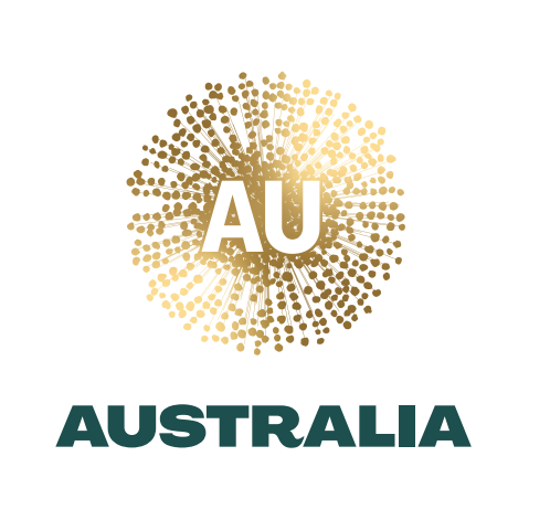
Australia’s proposed new international branding
The Nation Brand project was created to unify Australia’s various trading brands and imagery in international markets in a bid to “inspire the world to buy into Australia’s people, place and product”.
Why does our logo look like Coronavirus?
Yes it’s ridiculous! Didn’t need to spend any money at all! The kangaroo is very noticeable, and recognisable! Why you’d want the Covid branding beats me!! ???
Can’t help but think it looks like a COVID-19 virus visualisation…!
Did they check what Covid-19 looks like?
Really..? Cough…
I covered some pretty big brand failures in my time – but the timing of this and the design is breathtaking. Guys, read the room.
why are we advertising ourselves as coronavirus?
I know this project would have commenced pre-Coronavirus, but come on. To use their words, the Roo “simply reinforce what people already knew about us” – what does this new logo tell the world about us????? That we see ourselves as a currency and gold coin? Tone deaf!
It all but I’m possible to find anything of value in this design.
I can accept that the existing design cements cliches etc and might not change perceptions about Australia.
However, that is no excuse for the new design.
The answer wasn’t to be found in creating something new. The answer was to be found in taking what we already have and making it better.
That’s what Qantas does. That’s what Porsche does. That’s what Woiolworths does. That’s what great brands do. They take what exists and make it better.
It’s hard to imagine anyone, anywhere, understanding this represents Australia.
It’s impossible to imagine people seeing AU and thinking Australia.
It’s impossible to imagine anyone even bothered to see how new ID would look in mono.
It all seems based on an assumption that the world has an intimate understanding of the who, what, why and how of Australia.
It doesn’t.
This should be dumped immediately.
And an elegant, modern, update of the kangaroo logo should be created asap.
Australia deserves better.
yeah, its amazing how many designers dont see if their new mark passes the small scale/mono test.
This is appalling. The kangaroo is a symbol that is uniquely Australian and requires little interpretation. It’s uniquely ours.
The new recommended brand mark ” is embedded with a cultural richness and graphic voice that speaks distinctly of Australia”. BS! What symbolism links this to Australia. It looks like an abstract interpretation of “The Rona!”
OMG. It’s a coronavirus…
Ha ha – looks like COVID-19. Seriously bring back the Kangaroo.
I would add a comment, but everyone else has said what I was going to say. Other than that, words fail me.
Why brands continue to choose large advertising agencies to take on their visual/brandmark identity projects is beyond me. It’s like eating dinner at IKEA. Sure you can do it, but it tastes like shit.
So true – you see this so often, big orgs thinking ad specialists can generate their brand position for them.
And totally stealing the ‘dinner at IKEA’ idiom!
Me too! LOL
Love the IKEA analogy – thanks for that.
I’m sure that their is a powerful and lengthy rationale that supports this logo, however, as much as I always take a strategic approach, there has to be something aesthetically appealing and engaging. First impressions do count
I just came to steal the IKEA line. Thanks!
So Australia’s logo is COVID-19 now? Are we kidding?
There’s nothing else Australian they could think of…
This cost $10m according to the news! Why ditch the kangaroo, badly timed change with no real need.
This is what happens when ad agencies do brand and design.
It is not 1st of April today!
Are you guys for real? It looks like coronacast image from the ABC website!
There times when you need to change course mid project and take stock of current events.
Exactly. Even if the art had been finalised pre-COVID, someone, anyone in the room should’ve said: “Guys – this ain’t going to fly”.
An homogenous dotty circle with Photoshop filter for good measure. Distinctive, memorable, evocative and bold… not.
At least Gold Plated Corona Virus is distinctive and salient at the moment…
Whilst I can see the issues with the resemblance of the design to a coronavirus, let’s look at the bigger picture. As someone who did research that led to an earlier version of the trade brand (Australia Unlimited) I would like to support a few points
1) Overall nation brands are by FAR the most efficient vs. lots of cluttered small brands – there is a mass of evidence that this is the case. The Australia Made logo works well for products, but is less effective for services (and as noted above is not being got rid of… over time it will become a sub-brand).
2) the point about the kangaroo not being the best nation brand icon overall is spot on. Yes – it is easily recognisable but it allows no space to grow understanding of the things that Australia is brilliant at but totally unrecognised for: positivity, pragmatic innovation, skills and qualities for the 21st century!
And yes, this is a good time to launch a brand! The world needs positives right now.
Congrats Clems on this one (even if it means my work has now become historic!)
Funny how Qantas uses a roo to convey many of those attributes, though isn’t it?
It’s how you express the roo and how you build the story into it.
You don’t have to start with an empty vessel.
All for positivity, but would prefer something actually radical. A single brand that connects the impact of the tourism spend with the plethora of targeted marketing efforts.
Testing positive is the last thing the world needs right now.
A little of what you say is reasonable but just look at it – when the tourist industry is being slaughtered by COVID-19, why would anyone launch an identity like this. It’s not the appropriate time and it’s not an appropriate visual. So yes please “look at the big picture”
Carolyn so this the new Australia Unlimited brand? I’m surprised they are rebranding again?
This comment just demonstrates why brand testing can be disastrous if put in the wrong hands. The point of good branding isn’t creating a constantly changing vessel to load up with meaning, but to establish and then restively reinforce meaning (with the establishing bit the hugely expensive part). When you have a symbol which is worth billions in the meaning it has in customers heads, you need to justify why throwing all that value away is worthwhile. I doubt whatever research which was conducted met that threshold. Instead, a creative agency has hoodwinked the council into believing throwing their equity down the toilet is worthwhile, so they can bring in some revenue. Branding is about repetition not reinvention. Rant over.
Why would you get an advertising agency to do a brand design? This is what happens… you get non-implemnetable sh*t like this.
Yup, it looks like it was purchased of Creative Market with no real thought into reproduction, minimum size etc.
It is hard to believe that a team of marketing professionals could have come up with a design that anyone in the world will understand is “wattle” and only see as Covid-19. This is a a brand disaster of massive proportions only equalled by the “royal”—the name Prime Minister Bob Menzies—wanted to give our decimal currency and, of course, Edsel in the U.S. which nearly sunk Ford.
Well, it isn’t the coronavirus symbol, it isn’t much related to the wattle either, it does look vaguely 1990s in design, it is reminiscent of a splash of cash as if someone has dropped a collection plate filled with $2 coins.
It strikes me that Acacia is found all over the world, that wattle is sometimes confused with willow, and that the Kangaroo has been instantly recognizable as Australian in all four corners of the globe for hundreds of years. Then again, I am an old man.
Hhmmm,
This is ridiculous. If ever there was a Country in the World, that could boast clean / safe / food / travel – in a way that was totally removed from C-VOID – it is Australia.
What a shocking design and choice – it is a Corona Virus mock-up. Guys, appalling decision – I can’t comprehend that at all?
Having worked in this area over the years, I can tell you (a) that anything you do will attract a shit storm, but (b) Australia is blessed with more internationally recognised visual assets that just about any other country, and to ignore them just does not make sense.
From the shape of the continent, to the roo, the Sydney Opera House, and indigenous visual culture. (no disrespect to Balarinji, by the way, who do some great work). There are no shortage of assets that can become brand codes quickly, because they pretty much already are. But really, the roo.
But let’s not use any of that and start from scratch with something new and not identifiably, intrinsically Australian to the outside world. Let’s avoid the opportunity to have a single brand identity for Australia because of misplaced concerns that the B2C brand and the B2B brand are totally different when really it’s just that we can’t get our bureaucratic shit together. Let’s not use branding to leverage the well established positive sentiment towards Brand Australia into a more unified and efficient approach across the diverse range of marketing challenges.
Surely it’s not the Advisory Council’s job to recommend an approach that complies with best practice branding principles and delivers good ROI. After all, taxpayers don’t have anything better to spend our money on on, right?
Excellent response
Why does our logo look like Coronavirus?
Should be asking why Coronavirus looks like our brand. Surely this work was completed months ago prior to the pandemic.
I for one think It looks great.
Yeah, doesn’t matter that the defining global disaster of a generation which is ubiquitously recognised by its shape came along.
She’ll be right mate.
can wool be innovative?
This demonstrates all that is wrong with agencies. Throwing the baby out with bath water. How many $$ will need to be spent to get any level of recognition of this insipid covid looking logo?
I bet the designers had great intentions, and this was all based off awesome research and an even better hypothesis…but something tells me Clem will revisit this design and eat the cost.
Imagine the misplaced hate directed their way otherwise; Joe public will find a way to make it seem like an attack on Australian culture.
Does this mean every company that prints it overseas will have to pay for gold foil?
The woke police are out in force! Ha! I love the design – it looks sophisticated, and I especially love it on the dark green background. They are not getting rid of the Australian Made logo with the kangaroo.
This looks sophisticated and I love that it gives a nod to indigenous art. This logo is meant to stand the test of time – thinking only about it in context of today’s news cycle (ie – it looking like a virus under a microscope) is shortsighted. Stop reading so much tabloid media and take a step back and have fresh opinions! 🙂
How is it “woke” to point out that it looks like COVID-19?
It’s the equivalent of “fake news”, basically. He’s just trying to gaslight legitimate criticism (and it’s clear there are many learned brand people on this thread – almost all of whom are highly critical of the concept and execution).
Yep… looks like all the other the Corona virus images 🙁
A logo is like a joke. If you have to explain it, it doesn’t work.
At QANTAS they update the fleet, add amenities, enhance the experience all the time but they stick to the Kangaroo logo precisely because it, “simply reinforces what people already knew about us.” Which is just a wordy way of saying it’s instantly recognisable. Why would you trade that for another logo that has no brand value, is not recognisable but may (or may not) become so overtime?
So what’s the plan here? Invest thousands… dare I say millions of dollars (during a recession) in growing awareness in an abstract visual asset could be interpreted as almost any other type of flower (Chrysanthemum, Golden Dandelion). A symbol that people can’t recognise, understand, or attribute to Australia? The problem here isn’t the crafting of the symbol it’s the decision making of the Advisory Board.
Yes. It absolutely says “dandelion”, and unfortunately, that particular shape *also* screams “COVID-19” at the moment. It’s a lose-lose.
Can we also talk about how reverse text on yellow is just begging to be butchered in pretty much every execution, and is particularly bad in terms of readability? See also – the two different fonts they’ve used don’t match. At all.
I’m sick and tired of seeing work like this produced by big agencies. They are charging a fortune. For that price, the content should be incredible. And yet it’s almost always a disappointment. This one, however, takes the cake. The board behind this decision is also to blame, but the fact *no one* from the agency saw the problem with the iconography and did something about it speaks volume.
Doesn’t this break most important rule of branding? Be consistent and distinctive. No one can copy things like the kangaroo.
It might be ho-hum for us but folks in places like Europe dream of a trip to Australia for a lifetime. That’s what they want to see. I think we’re at risk of blending into the crowd here.
Yes, do something different. But don’t do it worse.
I predict a U-turn in, say, a month.
Maybe a week!
If you have to go through the strategy before somebody ‘gets it’, then it often isn’t a good design. Nothing about it says Australia. Perhaps Clems could sell it to Austria.
Back to the drawingboard
Agree 100%. If you have to explain the strategy, then it’s not communicating. Logos don’t come with an asterisk and a web address. They either work or they don’t. And this doesn’t work on any level.
Beyond the COVID-19 connotations, which are undeniable (however unintended), the colouration is highly problematic. White on gold? That’s a huge no for legibility/readability/accessibility. The “AUSTRALIA” font is also…a choice.
When you’re spending this much money to rebrand (and there’s so much more money at stake from stuffing it up) this is truly unacceptable.
Let me guess – the “board” that signed off on this are probably not in marketing, branding, and comms (but finance, law, and other such things…)
Yep…Twiggy Forest leads it. For God’s sake.
Awesome – looks like what everyone else above says. Also makes me think of a pokie payout…
Please tell me they weren’t paid with taxpayers money to brand us as the Land of Covid-19??????
I haven’t looked at this closely or thought about it at all, but I DONT LIKE IT
Good to see. I like the sophisticated look. I think it will be super usable in pitches for our offshore clients!
Looks cheap, unsophisticated and like a dandelion to me… Or something that plops out of the pokie machine . AU => Gold. A logo for the empirical symbol.
A bunch of branding people going off about a logo? Ironic.
There is obviously going to be so much than just this… Let’s give the creative team some time to showcase the actual work and then we can have an opinion.
And for now – at least it’s not a cringe throw back to a bygone time.
This reminds me of the Tropicana branding disaster from US agency Arnell: https://medium.com/better-marketing/the-worst-rebrand-in-the-history-of-orange-juice-1fc68e99ad81
Got rid of something tangible that sparked an instant understanding and emotional connection with something driven by philosophical branding fluff.
A modern take on green and gold? …Using our national flower? I actually think it’s beautiful work.
But no one, here or anywhere else in the world, will ever recognise it as the symbol of Australia. The point of a symbol is not to be pretty but to communicate. And anyway, it looks nothing like our national flower (which, by the way, looks like a lot of other flowers around the world).
Interesting point of view. I hadn’t thought about it like this. You are right – we need good news and a way to show the world just what us Aussies have to offer.
A modern take on green and gold… Using our national flower? I actually think it’s beautiful work
I actually don’t hate it.
I like the green and gold. We don’t have a way of showing up as Australia like NZ and Great Britain does. The intent is plausible and the logo looks indigenous which is awesome.
The AU looses me though. Not sure about that.
What the actual f*ck happened here? Did a drunk designer get inspired by Corona and throw a shiny gold layer on photoshop? I mean…
Another reason why brands should be designed by real branding agency not Ads. Advertisers think gold foil is the solution to a logo….
This is literally what you should expect if you trust Clems Sydney to design the branding for the entire goddam country. Whose bright idea was that ffs?
The client always get what they want –
Nuff said!
Am I the only one that looks at this and thinks Crown Casino?
Wattle???? Recommend that those involved with this project schedule an immediate booking with the closest optometrists asap if not before!!
The stippling effect combined with the colour variation is terrible in terms of accessibility. Looking at the gold on white version makes me feel like I have an uncorrected astigmatism.
Using AU together with gold foil makes it look like it was designed for a mining conference.
What elements of the design are meant to demonstrate pragmatism, optimism and skill?
Wow…talking about your original advertising w***kers.
I mean, hey, let’s not use the kangaroo for our international symbol because people automatically see a kangaroo and think of Australia.
So let’s create a symbol that makes no one think of Australia, that means nothing relevant to Australia, that kinda looks like a virus, and will confuse the bejesus out of anyone who sees it.
And we paid an agency to do ‘create’ this lunacy?
Whoever was the government minister responsible for this should be sacked immediately. Whoever was the department head behind it should be sacked immediately. And the ad agency behind it should be banned from all government related projects for the next 200 years.
What a laughable disaster.
Kill it. Kill it now.
Total disaster.
That the client and agency allowed this out says “shame upon both their houses”.
Neither get branding.
Neither know what they’re doing.
Throttle it now before any more money is wasted.
This is terrible. Agree with others about CV-19, or, is it golden shower?
AU is the chemical symbol for gold. Are we selling infected gold?
Get back to the roo.
Sorry, fail on this one. Gold colour printed in white stock is unremarkable. I will be asking my local politician for my money back.
If this is indeed some clever reinterpretation of the green and gold, surely they must have thought about how putting gold and AU together might be potentially confusing?
I’m not a fan of the design, or the alleged cost, but if only they’d used the letters AUS instead, at least it would have stopped people thinking this was a logo of a gold miner or bullion seller?
Congratulations. You just made Australia’s international branding a doily.
Oh my God, exactly!
I had a dream about this last night. No, seriously. Somebody had spray-painted it on the pavement outside a pub and passers-by stepped aside to avoid it. I hereby christen it “golden chunder”.
Gotcha!
It’s from an upcoming episode of Utopia. Right?!
Right?
If you think Clems Sydney had anthing to do with how this turned out, then you’re crazy. These projects get designed in comittee by a bunch of crusty old bureaucrats like Scott Morrison and co, who beat into submission every good option under the sun until they get to the least interesting thing anyone could’ve comeup with. Which in this case is something that looks like a puckered arsh*le. I feel sorry that Clems even have to be associated with it, because while they probably had to endure the abuse for the $$$ it aint their work.
Sure. Agencies should only take the credit for work other agency people wish they’d done, not responsibility for delivering outcomes of quality for clients.
…Except Clemenger wasn’t the agency that made this logo. The agencies which did aren’t advertising agencies and are sitting quiet while Clems get’s blamed. But in your words, they “only take credit for the work other people wish they’d done, not responsibility for delivering outcomes of qualities for clients.”
Well why did Clems choose to sub-contract to them, then?! It’s called accountability FFS. You take the huge pay packet; you deal with the responsibility to, you know, not cause an epic fail. If you took the money, and chose the wrong branding agencies to advise you, that’s entirely on you.
Normally I’d agree, but I reckon things get a bit different when you’re arguing with the Prime Minister of Australia.
I didn’t think of Coronavirus when I first looked at the logo. I did see a floral emblem of some description, so I’m not concerned about the ‘it looks like coronavirus’ thing. I like that they didn’t go with the kangaroo but, the whole thing is poorly executed. Punching out the AU in the wattle but then adding a stroke to the AU is a design flaw plain and simple. A crude cut out in the wattle for the AUSTRALIA wordmark is just lazy. The wattle will fall apart at small sizes. Advertising agencies need to stay in their lane and organisations need to stop engaging them for identity work. I hope this gets canned or engage a branding agency to fix it.
I work in a branding agency. It’s frustrating when you get a brief from a client like that. We’ve had 4 or 5 over the last 12 months.
They’ve burnt all the time, money and appetite for engagement with a non-qualified parter (typically an ad agency or a Big 4 consultancy) and got a result that they don’t love: (a) ad agency design team that doesn’t know what it’s really doing, doesn’t do it properly process wise and devliers something a bit shit that only works in campaigns, if at all (b) Big 4 consultancy that consults the shit of it and can’t then land an inspiring outcome, but sucks 6 figures out of the client.
Then you come in and have to magic a silk purse out of a sow’s ear with less than ideal budget and access to leadership.
Clients – ad agencies generally cannot do this work well. The Big 4 will cost you twice as much and can’t balance analysis with creativity very well.
Corona Royale. Very fancy.
I am assuming for $10m they have done lots of research to support this. I wonder who did that? How they did that? I am intrigued because it must have been skewed to get this result. I wonder if the client commissioner the research or the agency commissioned it?
I like how the implemented the kangaroo tail into the letter ‘R’ in Australia. Groundbreaking… (actually a nice touch tho).
It’s a lovely idea…but execution is everything. That “tail” doesn’t work because the font itself is far too stout/squat for the serifs to be truly decorative. It looks like a short person sticking out a cowboy boot! A kangaroo tail is much longer and lyrical/tapering in shape. This only says “kangaroo tail” if you read their concept notes. What a joke.
What the bloody hell is this?
Wow… just wow. Great example as to why advertising agencies should stay in their lanes. It looks dated, will not work at small sizes and resembles Corona virus.
Awesome work Clemenger Sydney.
WTF is this guys? Seriously – this makes me sad for even associating with advertising agency world… very, very sad.
Im never one for judging a rebrand by the brand mark (which everyone seems unable to get past). I’m also not a fan of trying to ram it with some bullshit rationalisation about how the ‘strong lines and aspirational form represent the ambition of the brand’ (AWARD rebrand I’m looking at you!)
But it does need to meet some basic criteria, the most important of which imo is practical application and legibility. This fails miserably on both parts and is, therefore, a huge huge L.
There have been some good rebrands done by ad agencies and some awful ones. If the agency has the strategists, writers and designers that understand and can produce top tier brand and design work, then sure, take it on. But if you don’t, then don’t try and bullshit the client into thinking you can. (Goes both ways btw)
Don’t know where this went wrong – could be a whole number of reasons, but i can’t help but feel if you gave this to an Interbrand, Landor, Houston, Frost, Re etc or one of the proven smaller agencies eg South South West, Studio Ongarato, For the People – we would not have ended up here.
This reminds me of the failed rebranding of South Australia back in around 1995. With a slogan “Going all the way” (all being underlined) and a Big graphic arrow embedded in the SA logo. I was in High School at the time and we all thought it was a big joke. That logo/slogan was quickly abandoned.
The fundamental issue that we see again and again is that we try to imagine Australia in a way that the actual external market does not. We are seen as a fun loving people, with an economy that excels in primary production, mining, education and tourism. Yet instead of playing to these strengths (and building on them eg innovation in farming, science etc), we want to ignore them and focus on services, agility, tech etc. When I go to work I don’t dress as an astronaut, as I’m not one.
For more examples of the rollout and the thinking behind it.
https://www.underconsideration.com/brandnew/archives/new_nation_brand_for_australia_by_clemenger_bbdo.php
The AU denotes gold, as an element, right?
If that’s the case and it’s intended use, I think it should be ‘Au’.
Shocker. More communication of national embarrassment towards our own identity. Made in Australia should highlight what we actually make. We don’t make Kangaroos, gold or wattle. Where is the craft, creativity, colour and humanity of Australians?
Well the comments make for interesting reading. Fave “read the room”.
??????
Oh no they’re for real !
?
I applaud that they didn’t use a kangaroo – as they mention in the branding guide, what happens when they want to co-brand with another Roo-logo company? Two stylised kangaroos would look strange. Apart from that, it pretty much sucks across the board. The typography is first-year student level crap (source: I was a first year student who designed crap), the wattle is… well, poorly timed for it’s visual allusions to corona.
Expect a rebrand in four to five years. Maybe this time they’ll use a branding agency.
Terribly disappointed. Why fix something that is highly recognisable and not broken? It could have been something that also says “Australia“ much better – our beloved indigenous boomerang!
When will ad agencies learn they are not brand agencies? Seriously, it does everyone and the industry a disservice.
Having been through a number of these branding exercises over the last 30 years there is a view among the elites that the use of the kangaroo as a nation brand is too cliched and looked down upon or is somehow secondary to the higher ideals of a nation brand. Then we see statements like “kangaroos simply reinforce what people already knew about us”…….. well, um, isn’t that the point?
The previous Australia Unlimited brand was confusing and poorly understood. Almost no one realised it was stylised boomerangs in the shape of Australia, then there was the irony of restraining the word “unlimited” within the two boomerangs and that boomerangs are weapons, often used somewhat ironically to kill kangaroos! That’s kind of weird.
At trade fairs and exhibitions globally people became accustomed to the kangaroo, seeking it out so they could be drawn to what the aussies are doing because it was always something unique and different, just like kangaroos. It’s not cliched, it’s not tacky and it’s not old-hat. Just want you want in brand recognition.
You will not see kangaroos anywhere else in the world. They are uniquely, quintessentially Australian. An animal that has adapted so wonderfully and beautifully to the harshest of conditions and is held in high esteem by our First Nations citizens and celebrated in some of the oldest art on the planet.
Kangaroos can only move forward, they are incapable of going backwards. Our armed forces use it. Our coat of arms use it. It’s on our currency. Our leading companies use it. I’ve been around long enough and seen enough to know that any arguments about co-branding with other kangaroo brands is just a nonsense – this is a calculated aversion to the use of the kangaroo. I can’t help thinking there’s an element of cultural cringe behind using the kangaroo.
If ever there was a branding opportunity handed to you on a silver platter and all you had to do was baby-sit it and make some minor brand evolution and stylising tweaks then the kangaroo is it. As sure as the Union Jack, the Maple Leaf and Bald Headed Eagle represent countries we don’t even need to name the kangaroo represents Australia and we should embrace it for everything it represents.
Well said
Well that’s poised to go viral ?
This wreaks of a job handed to mates. Why would anyone ask an ad agency to do a branding assignment? A first year marketing student knows that would be a mistake. Would they go to a graphic designer and ask them to make a 30-second TV commercial? I doubt it. There is a reason that branding and design agencies are specialists in their field. There are so many flaws in this design that any junior designer could shoot holes through. And no, I am not a disgruntled designer, I am actually someone who works in advertising, I just recognize which side of the fence we need to stay on. QANTAS has a kangaroo on the tail so as to make it easily identifiable as Australian. There is not a soul on this planet, outside of Australians, who know what a wattle is, let alone know where one comes from. Do they plan to have a disclaimer on the logo to help educate people, such as – *FYI this is a wattle, a flower found across Australia, just in case you were wondering, no it’s not a coronavirus. Oh, and AU doesn’t stand for gold it is short for Australia, but we got creative and shortened it from AUS as is most commonly used, hey we got $10M bucks for this, we had to do as much as we could to try and look like we were earning it.
Really?
A COVID disco ball?
The only reason given above and on the Austrade website is that older branding was used inconsistently. This is not a reason for new branding, just improved consistency. An explanation that is undermined by the continued use of Australia made logo, coat of arms, flags.
The design is forgettable and can only work with a limited number of backgrounds.
. . . and gold is soo tacky and AU is meaningless.
A COVID disco ball!
It not only uses a flower most Australians would struggle to identify, it is also incredibly lazy design. Wattles are referred to as golden, therefore let’s make it . . . . gold.
It’s worst sine is that it is forgettable.
Non-sensical reasoning: a horrid concoction of political correctness, cliche and lack of point of view.
Reinforces the perception that we’re unsophisticated, lack ideas, and don’t advance.
The last thing this says is, ‘Invest in us’.
Today, I’m embarrassed to call myself Australian.
What’s terrible is $10 million spent on an idea that kindy kids could have done better.
1. Obviously designed before Covid-19 hit. On that score alone that gives it a O out of 10.
2. Not recognizable as wattle 2 out of 10
3. Just another Splash like “Todays Special etc. Sorry another 0 of 10
4. Recognizable over time. That’s pretty much of an admission of failure.
Back to the drawing board PLEASE
I understand that it is fun to do a bit of a pile on – and the comments about COVID19 are valid.
However, why is no one questioning whether perhaps the problem was in the brief rather than the response?
I wasn’t party to this brief but was across a similar one around the same time this was issued and this response fits what the client was looking for….
You don’t think it’s the agency’s responsibility to respond to a problematic brief by identifying what parts of it are problematic?
Of course you want to get the job, but once you get it, you persuade where you can, and “design around it” where you can’t.
There are so many things wrong with the final outcome, I can’t believe the agency didn’t have opportunities to steer them on to a better path. That’s exactly what I do with my clients, and I have nowhere near the resources or clout that a massive agency has. No excuses.
In addition to many of the well written comments above- the gold standard (sorry, couldn’t help it) for brand design needs to come back to some boring basics including ‘Can it be read’, ‘Can it be said’, ‘Can it be understood’? This fails on all fronts.
How does it look in mono/ reverse? Fairly average I should think.
It’s a shiny new expensive toy that is so far removed from the huge stack of glorious brand assets we naturally have as a country (and yes, including the kangaroo) that I can’t fathom how this ever left first round creative.
Our newly released 2020 wattle inspired Australian Brand logo would suit an individual product or new product – one made in Australia. And NOT an umbrella for ALL Australian made products. The wording AUSTRALIA, in green underneath, should read: MADE IN AUSTRALIA. The approving committee, its designing agency and it’s designer have perhaps missed this most important point. Lastly, the kangaroo logo ticked all the boxes, and one questions whether it needed changing at all. A change of colour or gold foil would have done the job.
Yes, the ‘Electroplated Spore’ is the major-major problem….but then there’s the typography…I mean look at it…actually don’t, it’ll just make your brain itch. And not in a good way.
This logo is simply terrible. the gold is almost indistinguishable on white or basically any colour. The details get lost at almost any size it’s reproduced in. Dandelions are essentially weeds, not sure what message that’s saying about Australians. And like almost everything that comes out of big agencies probably got talked up to the client to the degree that almost makes the dam thing sound godly. Seriously, leave ads to ad agencies and branding to brand agencies. They aren’t the same thing.