Coke brings new single global design to Australia as variant looks killed off
Coke has called a halt to brand fragmentation across its lines in Australia with the launch of a ‘One Coke’ strategy which brings the colour red back to the centre of its design.
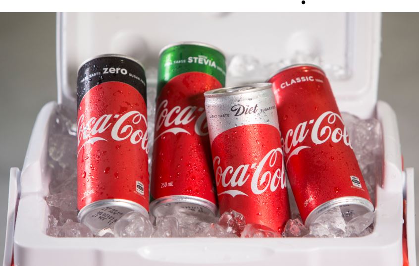
Coke has launched the biggest design change in 130 years
Faced with the prospect that the master brand would be eroded in the supermarket aisle by the year 2025 as the number of variants for the soft drink the company grew, the brand last year embarked on the biggest design shift in its 130-year history aiming to make Coke stand out.
At the centre of the shift is the return of the red disc featuring the italic and iconic Coca-Cola logo, which will now be central to all of Coke’s design and marketing around the world.
Looks like japans rising sun or rudolf the red nose reindeer not the greatest piece by coke standards
“She still embodies the awful stereotypes she did before!
– But she’s got a new hat!”
“A NEW HAT?… ill take two”