Ogilvy ditches founder’s signature as part of ‘re-founding’
David Ogilvy’s signature has been dumped as the agency’s logo in a global rebrand of the 70 year old agency he founded.
Ogilvy’s signature was adopted as the agency’s logo in 1999, a month after the legendary adman passed away at the age of 88 and a year after the company’s 50th anniversary.
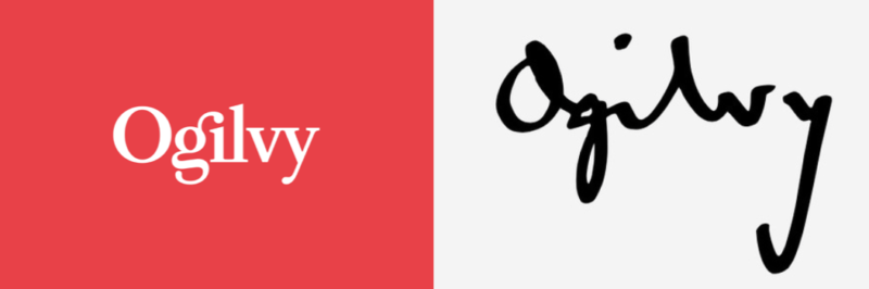
The new logo and rebranding are part of a restructure of the WPP-owned agency described by worldwide chief executive John Seifert as a “re-founding” which promises a simplification of its structure and a greater focus on the Ogilvy brand along with the launch of a consulting arm.
Announcing the rebrand to the Wall Street Journal last night, Seifert said: “The agency’s purpose is ‘making brands matter’.”
“In my view, if we were going to stand apart we needed to clarify what the Ogilvy brand promise was, what its purpose was and we needed to greatly simplify the organization around what I call an integrated enterprise agenda, not a holding company of all these different piece-parts.”
Seifert later told UK trade mag Campaign that the restructure is a return to the company’s roots: “We’re defining the purpose of the company in a way that we believe is true to the vision of David Ogilvy 70 years ago. This is about making brands matter and that means putting creativity at the centre of everything we do, as it has always been.”
The Australian office has already been affected by the restructure, with Ogilvy’s Sydney office reorganised with creatives, social and content creatives merged into one team in March.
As part of the restructure, the company will offer six core services: brand strategy, advertising, customer engagement and commerce, PR and influence, digital transformation, and partnerships. Ogilvy Consulting will focus on providing enterprises advice in the areas of digital transformation consulting, growth, business design and innovation.
“The whole idea behind One Ogilvy, pulling all the old silos into a more integrated, cohesive whole, is about responding much faster,” said Seifer.
“With more agility and cost-flexibility to organise the right talent for our clients depending on whatever complexity and set of needs they have, be that in individual markets, regions or globally, one aspect of our offering or all aspects of our offering. A big part of this is about becoming a much more client-centred organisation.”
For the details of the rebrand, Ogilvy’s Twitter account explained the elements of the revamped logo, including recut fonts.
The new @Ogilvy unveils a new identity and design system representing the agility, collaboration and creative connectedness that the brand is uniquely capable of delivering on behalf of our clients. @LCrampsie, our Chief Marketing Officer, Worldwide #NextChapter #MakeBrandsMatter pic.twitter.com/mSyt6Puv3x
— Ogilvy (@Ogilvy) June 5, 2018
It’s also interesting to note that Ogilvy have also backed out of all production by disbanding ‘H&O’ and partnering with Hogarth as part of WPP’s apparent focus on horizontality.
User ID not verified.
Just like the JWT re-brand fiasco, this will also fail.
The logo isn’t the problems – it’s what the logo means that requires
the re-think.
User ID not verified.
This is a very kiddish way to reinvent an agency which all the big clients are looking for.
User ID not verified.
Time is the new currency.
https://www.independent.co.uk/news/media/whats-in-a-name-the-future-of-advertising-13160.html
User ID not verified.