News

MullenLowe says goodbye to the challenger octopus with global rebrand

MullenLowe has unveiled its new global identity and refreshed brand positioning, evolving its iconic challenger octopus mascot.

The rebrand, originally designed for MullenLowe US, has been expanded to unite the network across 57 markets globally.
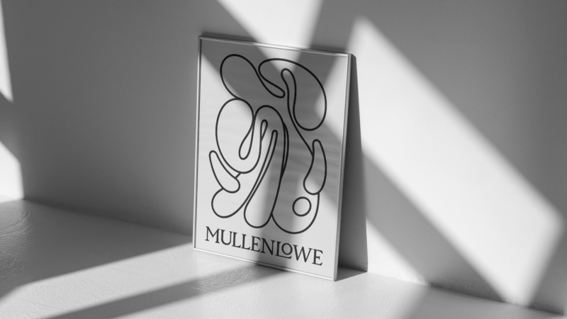
MullenLowe’s rebrand uses a fresh, fluid version of the octopus

MullenLowe’s iconic octopus logo has been transformed to a free-flowing, ‘kindred spirit’ version that the agency said represents how brands need to grow today.

CEO of MullenLowe Global, Kristen Cavallo, said the new design “offers a perfect metaphor”.

“The octopus has survived over 300 million years precisely because of its fluidity and ability to adapt. It is the only organism that routinely self-edits its own DNA – a model for how brands should behave today,” she said.

Head of design at MullenLowe US, João Paz, led the rebrand and said the agency wanted to “challenge the way brands show up in the world”.

Paz said: “Our octopus is not afraid of change; it’s in its nature, its DNA. We embraced that with a fully generative identity, crafted to show personalisation at scale.

“It is alive. It has a will, a personality, and, above all, it wants to move. With its endless twists and turns, it has the freedom to reinvent itself infinitely.”

In a decision Paz said aims to reflect the individuality of staff, MullenLowe employees have been invited to design their own octopus, to be used for email signatures and social/profile icons, using a generative app.

“We want the design system to reflect who we are and allow each person who’s part of MullenLowe to make their own mark,” he said.

The rebrand will take effect in Australia at 303 MullenLowe’s Sydney and Perth offices.

303 MullenLowe chief creative officer, Bart Pawlak, said: “The new MullenLowe brand strikes a perfect balance between paying homage to the past and embracing the future.

“It’s intentional malleability not only makes it applicable across multiple mediums and use cases, but also reflects the flexibility and adaptability that’s demanded of any modern business these days.

“It’s a testament to the smarts and strength of MullenLowe’s creative and design capabilities,” he said.

Cavallo said the new positioning is not just a belief, but also a promise.

“This is more than just a logo redesign. We have a point of view on how brands grow, and we built our identity and voice to reflect that belief. In a rapidly changing world, more of the same is not the path to long-term success. Brands need to earn and continually defend their unfair share of attention.

“Products might be boring, but brands can never afford to be,” she said.

The design includes a trademarked typography, inspired by the octopus

The rebrand includes a pattern that has been created to represent inclusivity at MullenLowe, as well as a trademarked typography, where the octopus’ tentacles have been morphed into letters and numbers that create a full typeface.

The new design is rolling out across the agency’s communications, including the website and social media.

ADVERTISEMENT

Get the latest media and marketing industry news (and views) direct to your inbox.

Sign up to the free Mumbrella newsletter now.


SUBSCRIBE

Sign up to our free daily update to get the latest in media and marketing.