Shrewd move, or lacking warmth? Designers give their take on Qantas re-brand
Qantas’ unexpected revelation of a new brand identity and logo this week has generated a good deal of conversation and comment.
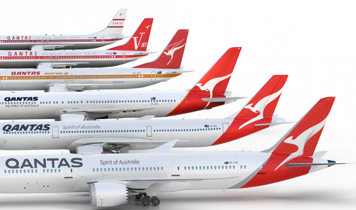
How the Qantas livery has evolved over the years
While Qantas’ head of brand Olivia Wirth and the man behind the new brand Stu O’Brien from Houston have given their explanation of the reasons for the changes, Mumbrella approached other notable design thinkers for their thoughts.

at the end of last last year i flew qantas (economy) from singapore to sydney. the ‘immediately after take-off’ meal was dinner. it consisted of a cardboard box containing one burnt chicken pastry. i now fly sa or cathay at every opportunity. and i wonder how many of the above designers are hoping to work with qantas in the future?
I agree with conscious pilot a hundred percent. The food in Qantas is way below par. I never understood Qantas’s love affair with Neil Perry. Even Business class food isn’t all that its cracked up to be.
Just back from a return trip to Asia with Qantas. Flew Sydney-Hong Kong, and yes the same sort of ‘meal’ for dinner as conscious pilot above. Followed several hours later by a greasy gozleme (Turkish flatbread) that I wouldn’t choose to eat at 3am on the way home from a big night out. Only time I’ve ever got off a flight ravenous. Oh, and on the flight out Qantas forgot to put my suitcase on the plane; on the way back we were one hour taking off due to failure of the auxiliary power unit. Fix the product first please Qantas.
Let’s just call it for what it is…. A font on a plane and several hundred thousand in fees and billable hours.
LOL…Genius comment!
Have to agree with both comments above. I fly QATAR airways all he time – they’re polite, helpful and the food is always great. QANTAS lost me on a long haul flight to London with my who has allergies. They stuffed up his food and expected him to go the entire flight on an apple. Really wasn’t impressed – the flight attendants were anything but attentive. Shocking.
Dear me,such is life. The previous complaints are usually from people expecting to get business class service at economy fares!
No Sven, just expect the same standard as other airlines! Not too much to ask. (See SA, Cathay, Air NZ). Qantas’ phone service atrocious (4 hour wait!) I agree, fix the business first.
Domestically I prefer to fly Virgin and buy one of their tasty sandwiches if hungry.
And don’t get me started on the fact that our national carrier has no international departures from Adelaide!
It’s strange that you chose to ask three out four WPP businesses. Why wouldn’t you cast your net a bit further Mumbo?
The vultures have swooped! Even a story on the re-branding of Qantas has brought out the “oh, poor me, what a shocking flight I had with Qantas” parasites. How typically Australian.
The wings on the old tail kanga were a really nice touch. I think most revs of the logo since then have been bullshit, probably senior staff proving their kpi and bonus by workshopping the least change.
Ask any punter and like most responding above, they focus on the inside experience. But you wrote about the logo, and thats what i think: the old winged hermes-the-roo was better.
It looks like they came up with it (the new design) in about 5 minutes – or even less. The lettering is oversized and looks awkward and the font looks like it’s from a newspaper. The former scheme looks considerably more aesthetic and streamlined.
So I just finished reading four insightful viewpoints on the branding refresh of an iconic Australian brand, and then read complaints about burnt chicken.
@Ryan
My point, and I think the point of the others commenting on ‘burnt chicken’ etc, is that there’s no point in spending money on a ‘branding refresh’ of a product when the product itself is crap.
It gets the job done.
Drop your pinky finger and get over it.
It looks a bit like the new relatively Google logo. Sort of flat.
This dull, boring mini update is a sad reflection on the lack of courage of Qantas management. The only winners are the design company. The notion of evolutionary change is nonsense. A lesson in a proper rebranding can be taken from Air New Zealand who out market Qantas in every way.
When Tony Lunn of Lunn Dyer brought the red tail and the kangaroo into the body of the plane in 1984 he started a revolution. Every change since then has seen the kangaroo more deformed and less proud. Lunn’s design, having the kangaroo silhouette extend beyond the edge of the red, created an elegance and balance that has been lost in subsequent efforts.
I find most logo changes pretty pointless- seems the marketing department is just looking for something to do. I kinda like the new QF logo, but why in the hell do it? So damned expensive to implement and basically no more memorable than the last one. Or one before that. Or before that really….
Derek,
I couldn’t agree more. I did a year of graphic design at Swinburne. I met Tony Lunn when he was checking in one day and I complimented him on the very revolutionary and attractive design. The triangle motif, to do the opposite of what most designers do – bring the aeroplane to the other items most of which are geometrically shaped like paper, etc. was simply brilliant to the point that the triangle became as much of a logo as the kangaroo itself. He and Ron Dyer spent months getting it right – if there was to be an update, it should have been done by them. The Hulsbosch monstrosity came as close to wrecking the design as possible – and I hate that he constantly fails to correct people when they say in his presence that he designed the original logo in 1984 – Tony Lunn wouldn’t have allowed that to be said about Harry Rogers’ 1971 design without correcting people but then, look at Hulsbosch’s other work – a boring and predictable re-brand for VA – he thinks it was a big deal to put the word Virgin on an angle – it was a insipid livery and still is – Woolworths, who were instantly sued by Apple for breach of trademark because the logo is almost a copy of Apple’s logo, even down to the similarity of the typeface. I can’t stand Hulsbosch, he’s a well below par designer – certainly way below the lofty standards of Lunn who by the way created some of the most iconic Australian designs which have stood the test of time only being replaced when companies merged or similar such as the 1980s BHP logo, stylised Australia with mine-shafts and quite a few others. Lunn’s design dropped the wings but treated the brand and the company’s visual history with ultimate respect, even re-working but honoring Rogers’ cyclone font he designed for Qantas. Everything else as you say since has been second rate. The Lunn typeface needed to be slightly bigger and the kangaroo maybe needed a tweak here or there but otherwise it should have been left alone.
In my work I spend a lot of time talking to clients about their Brand and how it is what they do, how they act and the Culture within the company and not just the logo. In an article about a re-brand the first six comments I read were all about the quality of the food and nothing to do with the logo. As someone who makes a living out or re-branding I think logos are incredibly important but they only succeed as part of a broader transformation of company culture. Hopefully this re-brand will be part of a broader cultural transformation which includes inflight meals!?
As for the logo design, it looks pretty armless to me…
Sorry guys, have to agree on both counts. I liked the winged kangaroo & as much as some may regard it a retro step it should be back on the tail. It was an iconic image. I sketched out a new design which faded red further up the fuselage to white but of course that would be too radical, & I would never have been paid as much. Oh, by the way, I’ve only flown QANTAS twice overseas & the first time in ’87 with a forced 3 hour stop in Athens with an unserviceable item soon after our Rome takeoff on a 747, & 15/8/16 in economy, BNE-SIN, on a refurbished A330, with a cardboard box containing some chicken mush I could’ve eaten with a spoon, & 3 other items on my fold down tray table, no plastic tray or containers to hold them. Even SWISS did a far better job. Sorry QF, back to SIA, my favourite since childhood.
It’s good that you had a female designer give their 2 cents too… oh wait.
Hi Bon,
We did approach a few people for the piece including female designers, these are the ones we heard back from.
Cheers,
Alex – editor, Mumbrella
Are you serious Bon? Why must everything be a politcial/gender issue. Red Herring. Focus on the font, ha
Just disappointing that we’re still talking logos when really we need to talk customer experience. Get that right and you’re almost in Brand Nervana. This stuff is just icing on a half baked cake.
The airline business isn’t easy. It’s one of those hard to please everyone all the time sorta thing. But I get the complaints around the food – it’s not necessarily about whether it’s good or bad – it’s more that others in the same class do it BETTER and that’s what you’ve gotta worry about. There’s choice and ultimately your customer will just go elsewhere, but only after you’ve pissesnthem off good and proper on a long haul flight for good measure. These experiences count. Start with your customer, that’s all you really need to know ?
The font looks great except for the “s”, that’s clearly produced by someone who doesnt understand fonts.
As for the airline… when you book a family of 4 Qantas do not guarantee that you will sit anywhere near each other. (we found out the hard way)
No-one, including Wirth or O’Brien has said what the brand is. How can you evaluate the logo without reference to the brand values?
If this is a re-branding, in O’Brien’s words, ‘part of an overall transformation of experience and product’, what is that transformation?
Font is OK – though I agree with above that there is something not right about the ‘S’. But the logo now just looks like a big streak of pelican shit down the tail….
Some idiot dropped a bucket of paint on the tail.
I think the new design is great but as an airline Qantas leaves much to be desired aand as other’s have suggested brand identity can’t hide a poor product. The Neil Perry food is awful . I flew First to London via Singapore a few years ago and as the food was so awful I asked for scrambled egg for dinner to be given the response that I can only have it at breakfast. I stopped flying Qantas internationally after that and only use them on domestic.
Qantas use their own internal catering company called Q catering, other airlines such as Jet Star and Air NZ use Alpha Flight Catering. Alpha Flight seem to deliver a much higher standard, Qantas should scrap Q catering and sign up with Alpha.
Rubbsh, Q Catering are one of the premier catering operations in Australia and by international standards, in the world. They don’t decide the menu, Qantas decide that and Q Catering just carry it out… many of the companies like Gate Gourmet don’t actually MAKE food, they option items in from other Caterers… for example, Gate Gourmet cater Virgin but get the business class meals from others. Q Catering provide catering to the likes of Singapore Airlines and many other leading airlines. I don’t hear anyone complaining about the meals provided by Q Catering on their services.