


Tatts Group unveils new brand identity
 Gambling company Tatts Group has unveiled a new brand identity as part of a strategic repositioning project undertaken by communications agency Hulsboch.
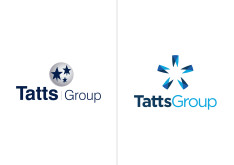
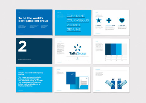
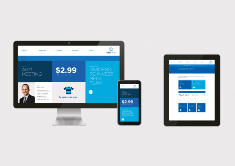
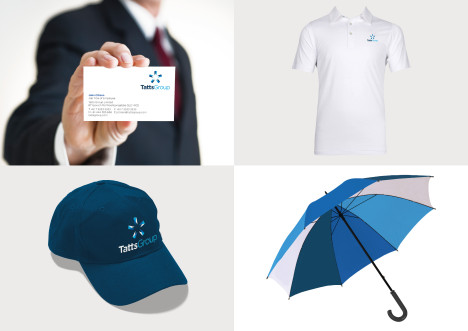
The new brand identity aims to position the group as a leading global lottery, wagering and gaming conglomerate and has seen its logo transformed from a group of stars into an icon suggestive of a star, while the brand’s colouring has shifted to a brighter blue.
Executive creative director Hans Hulsbosch said: “The new identity for Tatts is a key contributor to the Group’s business evolution and sets a strong framework for the future. The simple, clean, contemporary logo style is composed of two components: the top graphic known as ‘the star’ and the distinctive lettering ‘Tatts Group’.
“In addition the colour palette brings scale and boldness to the brand identity. I’m delighted that this transforming creative review represents the spirit of their values and is a unique recognisable symbol of their brand.“
The Tatts Group new brand identity is being implemented currently with new national wagering and lottery identities’ to follow.
Robbie Cooke, CEO, Tatts Group said: “Tatts is a leading Australian gambling group with a 130 year proud heritage. We are making changes across all facets of our business and our new corporate brand identity is symbolic in positioning the group for the future.”
Credits: Hans Hulsbosch, Executive Creative Director – Jaid Hulsbosch, Director – Linda Jukic, Creative Director – Belinda Hubball, Design Director – Julia Clyde, Account Director – Samantha Pang, Account Manager
Miranda Ward worked for Mumbrella from 2013 to 2017, eventually becoming deputy editor. Miranda joined Mumbrella in September 2013 from Sky News.
 Linkedin
nice work, much better than the old one
User ID not verified.
‘new wagering and lotteries work to follow’. these guys do all the major jobs in australia.
User ID not verified.
The logo is cool. The implementation is good. Why is there no logo on the umbrella?
User ID not verified.
These guys just nail it. Great job.
User ID not verified.
How does this make them look like an ‘entertainment company’? Sure it’s cleaner, but I don’t feel excited to interact with them.
User ID not verified.
Whilst it’s quite funny for your peers, writing positive reviews of your own work every time it’s posted is … Nice, Emma, Rain… Seriously!?
User ID not verified.
hahaha, love your work whistleblower, however not everyone that posts has to have a vested interest.
Hulsbosch does good work, however i’m looking forward to
“…… with new national wagering and lottery identities’ to follow.”
that will be the test (the consumer facing brands) rather than a new look for the parent company.
the black
User ID not verified.
Looks like 5 teeth arranged in a circle.
Which is ironic if you go to TAB’s – a lot of the people don’t have teeth… Maybe that’s the inspiration?
User ID not verified.
The umbrella is the logo – same shape and colours
User ID not verified.
Strategy? Did anyone say strategy?
User ID not verified.
Another utterly disappointing result from these serial brand offenders. brand strategy anyone?
User ID not verified.
@ lachie – Clearly you have no idea. ‘brand offenders’. Pfft, pleeeeeeeeeeease
User ID not verified.