Retail packaging: what works, and where some brands went wrong
While it’s important for brands to adapt to changing market conditions, changing the wrong elements can turn profit into decline, explains John Horgan in this guest post.
Packaging is one of the most powerful (and somewhat underrated) marketing tools a brand has: it’s the key touch point in store, and as such has an audience reach potential far beyond that of any other communication channel.
With that in mind, pack design decisions can lead to commercial disaster or significant gains.
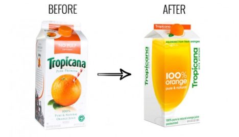
The well-known case of Tropicana’s 2009 pack re-design provides some clear evidence of this, with the net effect being a full 20% drop in sales as a result. There are some useful lessons to take from this to ensure brands carefully consider any pack development and avoid any such disaster for themselves.


I’ve read decoded too.
How Brands Grow: What Marketers Don’t Know, anyone?
Reference in the article to a paper by the same author(s), http://marketinglawsofgrowth.c...../17122.pdf
Interesting article.
Going back a couple of years – Continental dry sauce mixes relaunched their range in a similar way to the above Coca Cola example – changing from predominantly red to white. It was such a disaster that they had a out a TVC featuring the CEO to explain the change to consumers.
A recent example is the new Body Shop packaging. It seems to have been designed by an accountant, pretty much removing every element that may contribute to recognising the product in store. A total disaster.
The Issue here is very timely and informative, there are things must be consider before choosing a packaging in retail product. thank you