Features

Campaign Review: A new look for Coles, rebrand for Commbank, and Holiday Here This Year returns

Mumbrella invites the industry’s creatives and strategists to offer their views on the latest ad campaigns. This week: The General Store's Danny Lattouf and CHE Proximity's Jeremy Hogg give their views on the Commonwealth Bank's rebrand, the latest Holiday Here This Year from Tourism Australia and new work from Coles.

Brand: Tourism Australia
Campaign: 
Holiday here this year, for Australia
Agency: M&C Saatchi
The verdict: Just misses the mark

Danny Lattouf, chief strategy officer at The General Store, says: 
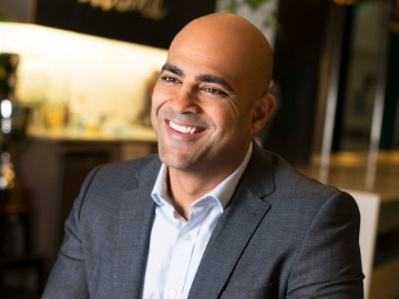
I love Hamish. I’m a fan – I think he’s hilarious. What I love about this work is the relatable nature of it all – Hamish is a big personality in this country but his delivery is always so familiar that it feels like he’s really one of us – and awesome to see Zoe here too of course. A great departure from campaigns looking at internationals heading our way with global Australian icons – it’s a nice shift (selfishly from an Australian’s POV).

I think the message to have us really considering places we’ve never been before didn’t land as strongly with me as I’d probably hoped it would. The Holiday Here platform has real stretch in it and I’m anticipating this component will find it’s way more and more so in the frontline of work to follow. It’s crazy to think sometimes that I’ve been to over 40 countries around the world but am yet to visit Tasmania – now is the time to drive this message home.

Rating: 6/10

Jeremy Hogg, creative director at CHE Proximity, says: 

I’ve got to commend Tourism Australia and M&C Saatchi for continuing to encourage travel and planning more trips within Australia. Given no one knows when we’ll be able to travel around the world freely again, the approach to keeping people spending on domestic travel and making time to enjoy themselves feels like a solid one. I know a lot of our internal borders are still closed — but I don’t think the outtake of this campaign is asking for us to be extravagant, it’s just asking us to take the time to holiday whenever and however we can. A reminder that there’s a lot to love all around the country.

Celebrity aside, I like that the approach taken has been budget conscious in terms of production — it feels appropriate to the time and the execution. It’s really simple and does just enough to encourage people to do something they’re pretty inclined to want anyway.

Think I need a holiday.

Rating: 6/10

Brand: Commonwealth Bank
Campaign: 
Can lives here
Agency: M&C Saatchi
The verdict: ‘It’s a nice yellow’

Lattouf says:

Coming out of a very difficult time via Royal Commission and marching into COVID-19 as a standout leader (in my opinion) was one of those things we might have come to expect from big business. To turn serious challenges into great opportunities isn’t something that we should overlook so simply. I believe the rebrand and campaign are timely – it feels to me like CommBank has it’s groove back and it’s a great time for them to share their position with the market and doing so from a place of real confidence.

I believe the ident is a nice move on from where it was, a subtle step forward with a contemporary feel, increase in icon size is yet another symbol of confidence from the brand. I do struggle with having a “shadow” differentiate a logo from a basic shape – in my experience that proves very difficult in execution, especially in practical applications throughout the business. Hoping they prove me wrong there though.

I thought the film was beautifully written and executed – these things can get a little long winded and generic, but there were some phrases in there that really captured the essence of Australian character – A reinforcing statement from a brand that knows (and should very well know) it’s customer.

Rating: 7/10

Hogg says:

I really liked the old logo. And the new one is quite similar, so I guess I like it as well? It’s a nice yellow and it’s stayed true to what was good about the original design.

I’m just not sure why you’d make such a minimal change after 30 years, especially when it’s going to have a profoundly expensive cost associated with rolling it out across thousands of branches and all the collateral that goes with it.

But it’s a nice yellow.

I question whether this one will age quite so well as the previous. It feels like it might have a shelf-life that’s well shy of 30 years. Gradients tend to do that. It’s interesting that there’s a number of brands modernising their logos at the moment, and most of them are going flat, a la Volkswagen. Whereas this is doing the opposite.

Rating: 6/10 for the logo, 3/10 for that script typography in the film.

Brand: Coles
Campaign: 
Value the Australian Way
Agency: DDB Australia
The verdict: A strategically smart investment in brand value

Lattouf says: 

It’s nice to see this come together for Coles.

For so long, Down Down and Cheap Cheap eroded brand value and further focused shoppers on price in grocery. For many years, this lead to the great growth that Aldi experienced – who were more than happy for Aussies to start putting brand value to one side and better focus efforts on price comparisons. It played beautifully into their hands and when Woolworths and Coles were ready to move on from that battle, and we saw the arrival of “That’s Why I Pick Woolies” and “Good things are happening”. Moving off price and into better narratives on “Why” make the more conscious decision to choose one over the other (beyond price).

Sure enough though… before we knew it, Coles moved into tricky territory with things like “Good things are happening to prices at Coles”. Deviating slightly from where they started, but potentially was always the plan with a platform that could stretch in that direction.

With COVID-19, the response and the outright pillar of society our supermarkets have become in 2020, this campaign brings it all together – I think it brings “Down Down” and “Good Things” together in a way that is meaningful for Australians and one that is highly culturally contextual (and will be for some time to come).

Rating: 7/10

Hogg says:

Do I love this work? No. But it is an indication that Coles might be trying to do better. I can only assume they’ve gone to DDB to add a bit of scale and polish to their advertising, which has been distinctly lacking for as long as I can remember.

I don’t think this is all the way there, and of course it’s not Aldi good. But it’s not Down Down Prices Are Down, it’s not Curtis Stone talking, and it’s not quirky people masquerading as staff, wearing giant red hands and singing. So there’s a lot to not hate about the new direction.

Apart from Aldi, who genuinely do have a unique position in the marketplace, I believe Woolworths has held the stronger position of the two major supermarkets. The Fresh Food People is a strong claim, and there’s probably not a lot more you can want from your supermarket (other than putting a stop to the eroding of prices paid to farmers and polluting our planet and children with Ooshie promos).

So strategically, this new work seems smart for Coles. It gives them their own space to play in gaining some sort of brand affinity. It’s less about price and more about the way Australians live, of which supermarkets and food legitimately play a very big part.

As a film, it’s a bit slice of life with product placement and red forced in wherever it can. In judging this piece of work I think you need to look where the work has been, and in doing that you can see it’s come a long way. Coles should benefit immensely from working with DDB to bring more humanity and likeability to the brand.

Rating: 6/10

  • As told to Zoe Wilkinson. If you’re a senior creative or strategist who would like to take part in a future Campaign Review, please email zoew@mumbrella.com.au
ADVERTISEMENT

Get the latest media and marketing industry news (and views) direct to your inbox.

Sign up to the free Mumbrella newsletter now.


SUBSCRIBE

Sign up to our free daily update to get the latest in media and marketing.