Features

Campaign Review: Is it time for Coles to shake it up? Did Seafolly miss the mark? And has Instagram successfully revived its heart?

Mumbrella invites the industry’s creatives and strategists to offer their views on the most-talked-about ad campaigns. This week: Emotive's Ben Clare, and Wunderman Thompson's Brona Kilkelly offer their views on 'Owning your folly' with Seafolly, Instagram's first national campaign, whether The Kids' Cancer Project is confronting in all the right ways, and if it's time for Coles to shake it up.

Brand: Seafolly
Campaign: Own Your Folly
Agency: Thinkerbell
The verdict: Diverse casting would have made the campaign a breakout star

Ben Clare, group creative director at Emotive, says: 
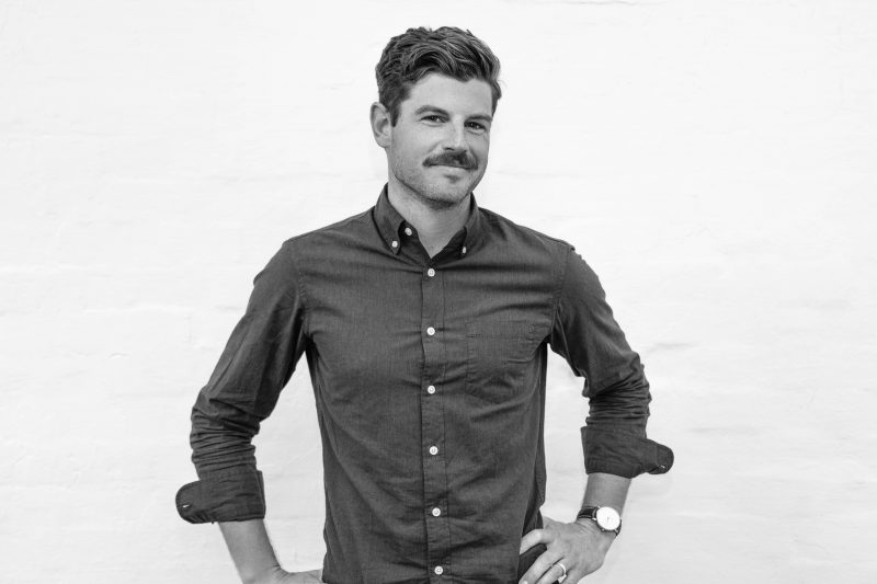
“Arguably the biggest challenge I had with this Seafolly campaign was simply convincing my wife that I had to watch it for work purposes. Beyond that, there’s a lot to like about the line, ‘Own your folly’. For a brand that’s been around since 1975, it’s about time they invested in something resembling a platform. Like a well-worn pair of togs however, the strategy does feel like a bit of a stretch. Not that it’s not admirable, I find it just gets a little lost in a sea of brands, from shampoo – #shinestrong – to designer shoes – #marchon – all driving to sell young women empowerment. Can’t fault them however for doing a good job of capturing the youthful exuberance so often missed by marketers.”

Rating: 7/10

Brona Kilkelly, senior strategist at Wunderman Thompson, says:

“‘Own your folly’ has the potential to be a brilliant move for a brand that is now competing with a slew of new online competitors. Influencer marketing is providing a platform for these emerging swimwear brands and the influencers are often posed within an inch of their lives to ensure they maintain the perception of perfection. This platform offers a refreshing contrast to such personas by celebrating the rebellious, throw-caution-to-the-wind attitude and irreverent tone that is uniquely Australian. If they had just remembered that today Aussie women are proudly all shapes, shades and sizes, this campaign this would been a true breakout star in its category.”

Rating: 7/10

Brand: Instagram
Campaign: Get into what you heart
Agency: In-house, supported by Wieden + Kennedy
The verdict: Struggles to tell Instagram’s unique story

Clare says:

“As a former boyfriend of Instagram, I have a few questions. For a brand that has just announced a trial to hide the number of ‘likes’ from users of the platform, it seems odd then to place the iconic, ‘like’ heart symbol at the forefront of your campaign. I understand that, ‘It’s not about getting likes, it’s about liking what you love’, but I’d wager people’s subconscious will say otherwise – however bold and vibrant the work may be. Moreover, it seems remiss to simply present Instagram as a place to explore your passions and interests. Surely, as a platform that has changed the way we travel, diversified beauty standards, launched businesses from thin air and sparked global movements, Instagram has something more compelling to tell an audience that spends 35-minutes a day on it.”

Rating: 5.5/10

Kilkelly says:

“This campaign cleverly reframes the contentious heart symbol from something the Instagram community currently leverage as social (and real) currency into a celebration of the community’s passion points, but don’t think this is the campaign’s sole purpose. This is clearly a campaign to encourage users to stop switching from Instagram to other platforms for their content fix. We know that there’s been a big push for IGTV and Facebook Watch to be the leading destinations for longer-form content, but this campaign suggests that content creators and viewers alike are needing a little nudge. While the creative captures the vibrancy of Instagram’s content through a number of passion points, it also highlights the struggle it’s having differentiating itself from YouTube which is known for its ‘super star’ content creators and ‘must-see’ moments. I think we have yet to see how Instagram and Facebook intend to knock the king of long-form content off its podium.”

Rating: 6/10

Brand: The Kids’ Cancer Project
Campaign: I don’t want to be an angel
Agency: Saatchi & Saatchi
The verdict: Devastating and disruptive

Clare says:

“As a father who spends roughly 650 minutes each week yelling at his children to either brush, flush, hush or rush, I can relate to this. And presumably others. The line at the end, delivered by the young boy whispering to his mother, ‘But what if I don’t wake up?’ is devastating, and hopefully enough to compel action. I personally prefer charity advertising that promotes an energy of optimism and togetherness, but I get the need to take a different course in a landscape that sees a new Australian charity launched every single day. It’s an incredible cause and I sincerely hope it works its socks off.”

Rating: 7/10

Kilkelly says:

“There can be a lot of tripwires when it comes to delivering disruptive comms in this space, however The Kid’s Cancer Project has struck the right balance between being powerfully provocative whilst treating the subject matter sensitively.  The print nails it with its defiant hand gestures and attitude, but disappointingly this potency is lost in the TVC. Here the take out is less about the children’s fighting spirit and more about their overpowering fear. It feels that perhaps nervousness over the hand gestures (which to my mind are absolutely essential to convey defiance in the print),  has got the better of them when it comes to TV. If only they had held their nerve and continued with defiance into the film (which could have been signalled in another way if the hand gestures were just too strong), then this could have been a 10/10.”

Rating: 7/10

Brand: Coles
Campaign: Good Things, Great Value
Agency: Big Red
The verdict: Is it time for something different?

Clare says:

“It’s hard to find fault with this. Bereft of any meaningful idea other than to lower the price of chicken, it just feels like another Coles ad featuring Curtis Stone – which might suit the retail-driven juggernaut that they are, but at the end of the day, it feels a bit like celery. It’s everywhere, but never really seems to make that much of a difference. With Woolworths on a fresh offensive and Aldi quietly stealing market share, perhaps it’s time they cooked up something different?”

Rating: 6/10

Kilkelly says:

“Evolving their price-drop strategy from being solely for price sake (down down), to a platform that helps its customers to attain the lifestyle that want, for the price they can afford is a reframe strategy from Coles. The message is very direct in the OOH, but the TVC builds on the joy great food brings and how Coles is making it affordable. Knowing that the cost of living is a key concern for Australians this platform positions Coles as ‘on your side’.

“It shares some resemblance to Tesco’s hugely successful and long-running ‘Every Little helps’ campaign and it wouldn’t be the first time that Aussie retailers looked to the UK for inspiration. After all, Curtis is Australia’s Jamie Oliver. If the rest of the campaign follows in the ‘Prices that help’ approach, I think it’s likely that this will translate into an increase in sales as Aussies allow themselves to indulge in a Curtis-style curry knowing that it won’t break the bank.”

Rating: 7/10

  • As told to Zoe Wilkinson. If you’re a senior creative or strategist who would like to take part in a future Campaign Review, please email zoew@mumbrella.com.au
ADVERTISEMENT

Get the latest media and marketing industry news (and views) direct to your inbox.

Sign up to the free Mumbrella newsletter now.


SUBSCRIBE

Sign up to our free daily update to get the latest in media and marketing.